skip to main |
skip to sidebar
With the year almost at a close, I thought I would carry on the tradition of posting some of my favorite photos from the year. I think it's good to look back on your work and be inspired by it from time to time. So, in no particular order, here we go:
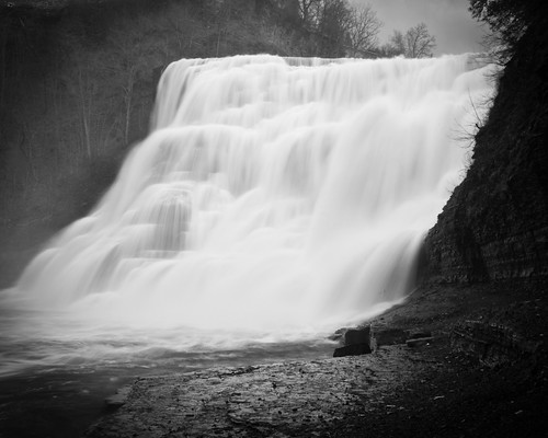
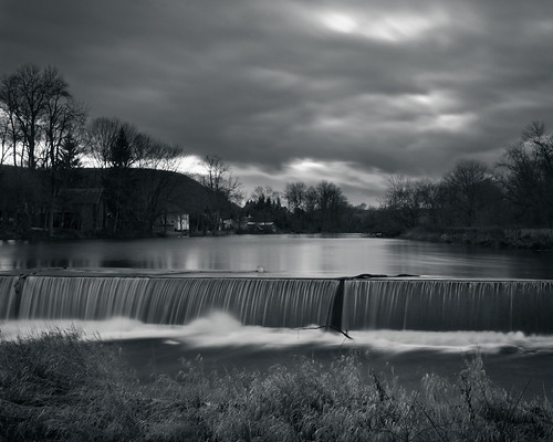
"Buttermilk 3"

If I had to pick a favorite, this would probably be it. I love the circular lines in this one, and I think the exposure and framing are spot on. I'm very happy with the black and white conversion on this one, too. I like the tall crop, but it would work well as an 8x10, and is on my list to print.
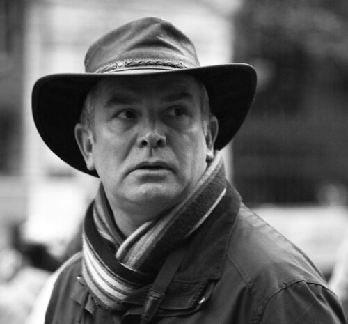
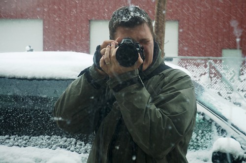
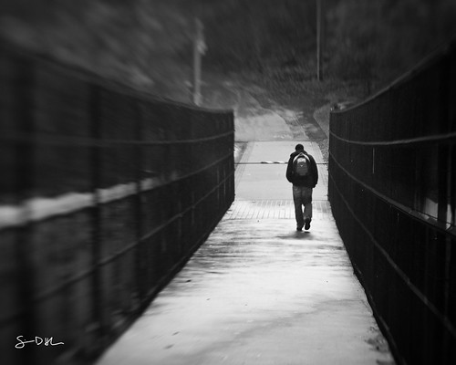
"Photographer at Work"
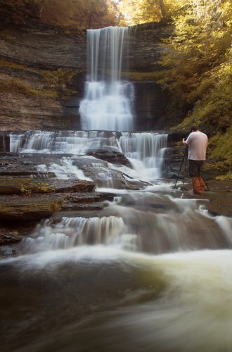
Big props to Adam Baker for showing me around the falls here. (If you haven't noticed, I like to photograph waterfalls now and then.) Here he is pictured on one of our outings, doing his thing. Fortunately he decided not to move for the 1.6 second exposure, probably in the middle of a 20 second exposure of his own. It's a fairly accurate portrayal of waterfall photography - standing still in the middle of a stream for ridiculous amounts of time as your toes go numb, hunting motion and cursing the sunlight.
"Triangle"
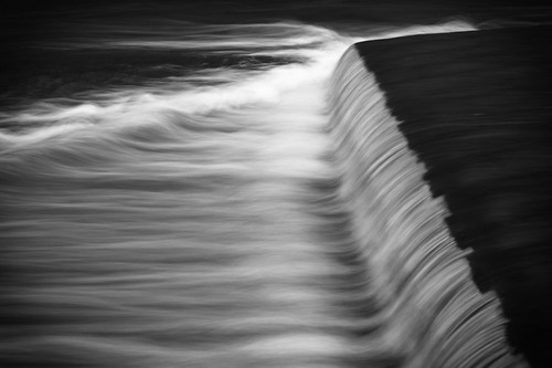
Last waterfall in the bunch. Found this little six inch drop just past a dam. For whatever reason, the little rapid past the falls made a triangle shape in the stream. I'm all about moving water, geometry, and black and white, so I couldn't help myself. The relatively short (1/2 second) exposure left some interesting texture in the spray, resulting in an almost painterly abstract. This is definitely on the "to print" list.
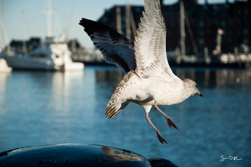
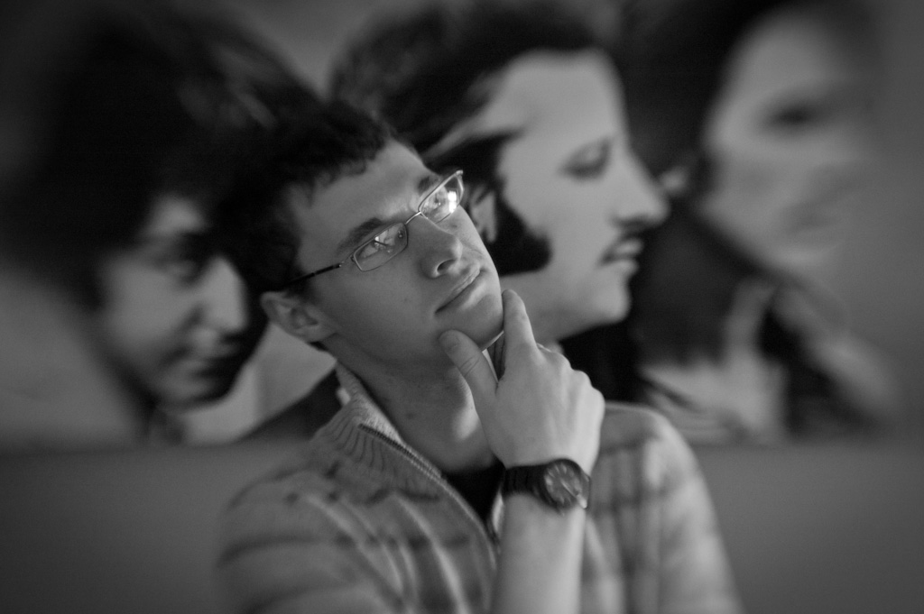
"Too Close!"
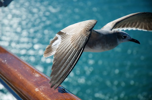
Technically I took this on December 29, 2009, but as it was too late to make it to last year's "best of," I'm including it here. My blog, my rules.
This photo breaks a lot of rules, and I think that's what makes it so interesting. My favorite part is the sharp focus and detail on the wing, with the rest of the bird blurring away into the background. The chopped off wing and lack of leading space leave a lot of tension and a good dynamic feel to the frame. Who knew that a pissed off seagull would be one of my favorite subjects :)
"State Street"

In the spirit of breaking rules, I give you this out-of-focus offering. I wasn't sure about it at the time (see my comment on the photo on the Flickr page), but I think it works. I like how the few isolated lights pop off the blurred background. My 50mm f1.8 has straight aperture blades which leads to those little polygons instead of round bokeh, and I like that. Those heptagons become the subject against the blurred impression of a street corner at dusk.
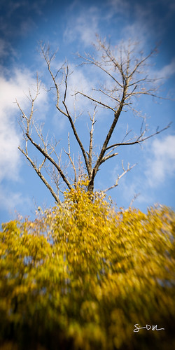
"Fall in Monochrome"
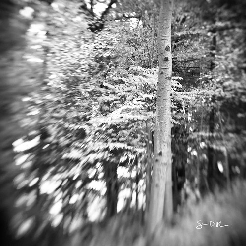
Speaking of blur, I love the depth and texture that the lensbaby gave to this fall shot. (And yes, I am the type of person who converts fall photos into black and white.) I wasn't planning the black and white at the time, but the color didn't pop as much as I had hoped, and after a quick click on the "black and white" button I realized that was the way to go. I almost always do a quick b/w conversion with my photos to see if I like them better or not that way. Sometimes I'm pleasantly surprised by the results.
"Cactichoke"
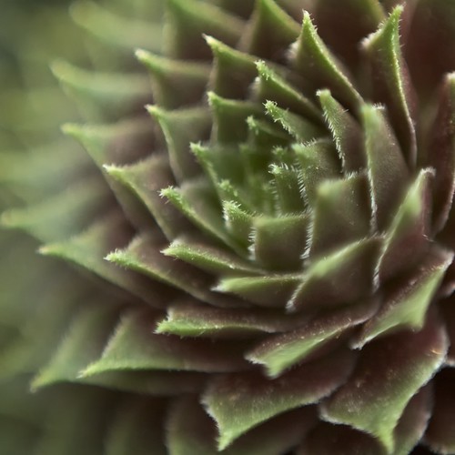
Reverse 50mm macro is a lot of fun to play with, especially when you're in a greenhouse full of exotic cacti. The fine detail on these plants is amazing, and I like the smooth blur combined with the sharp spines on the cactus.
"Buzz"
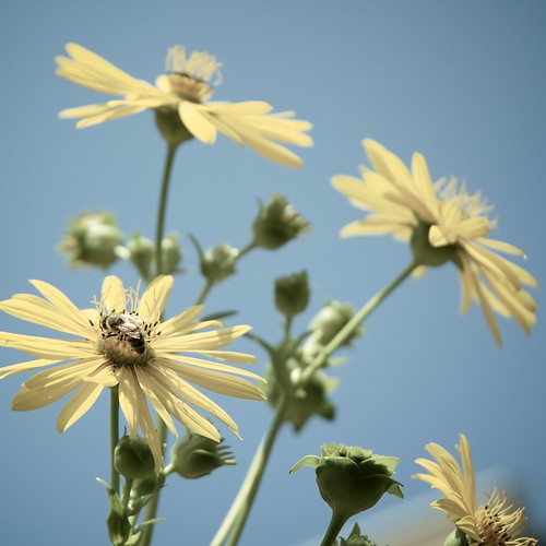
I like this one because it reminds me of summer every time I look at it. The slightly warm and desaturated treatment feels like a hazy summer day.
That's it for the year. Interesting to see what I've been shooting. 4 of the 8 are square crop (no real surprise). 3 of the 8 are of waterfalls. 3 of the 8 are in black and white (surprised it's not more). 8 of the 8 resonate with me in some way beyond being a "pretty picture." I am a bit biased, though. Would love to hear your thoughts :)
~S
[title of blog] on flickr
© 2010 Simon Hucko
Been in a real photo rut lately. I blame the weather and general holiday craziness. Hopefully things will settle down a bit in January and I can get back into the groove with my photography. I'm not doing a 52 weeks or 365 project next year, but have some other short- and long-term projects in mind that I'll discuss more in an upcoming blog post.
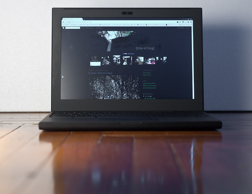
My photo this week was a quick product shot to accompany my Chrome OS review. When I say quick, I mean it took me about 10 minutes from opening the camera bag to uploading the photo. These little product shots are pretty easy, and are good to be able to do when you're listing photo equipment for sale. (How many bad or non-existent photos have you seen on craigslist or eBay?) Or, in my case, they add a nice personal touch to a blog post about gear. A few tips to taking photos like this:
- Find a clean surface to set your item on. I used the floor. Tables work well, cutting boards, desks, paper, whatever, as long as there isn't any clutter on it.
- Make sure the background is free of distractions. A blank wall works. I used a piece of foam that we had lying around. Posterboard or foamcore work great, too.
- Light your item. I grabbed a work light, a desk lamp can work here. (Or any other light, the brighter the better.) I used some tissue paper for diffusion, but printer paper works pretty well in a pinch (you lose more light, though).
- Compose, focus, shoot, edit. You might need a tripod if your light isn't that bright. Editing should be fairly simple if you did the first three steps. I used the foam to set white balance.
Easy as that.
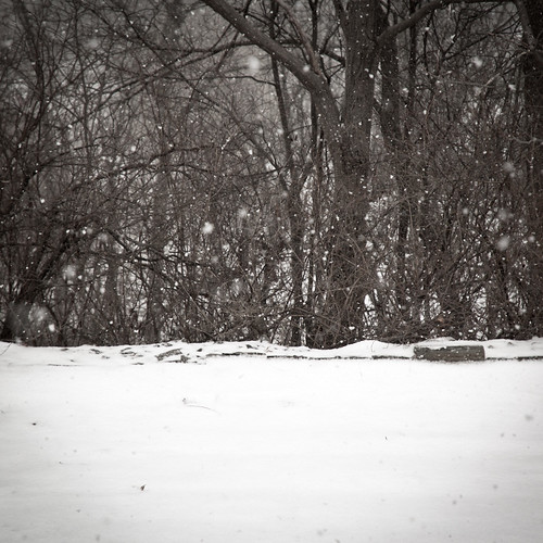
My pick this week is "snowfall" by irv_b:
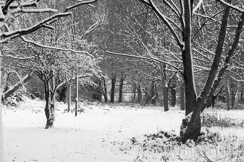
Along with being the *only* photo this week, Irv captured the new snow very nicely. Exposure is right on. I like the layered composition, lots of texture to hold me in the image. The only thing I might have done differently was crop in on the left to remove the trunk at the edge of the frame. Nice balance between the two main trees. Thanks for sharing your wintry wonderland with us, Irv.
2 weeks left. Would love a strong finish here from everyone :)
~S
[title of blog] on flickr
© 2010 Simon Hucko. Please do not use without permission
I was somehow lucky enough to be selected for Google's Chrome OS pilot program. Since this is like winning the geek lottery, I thought I would share my experience here on the blog for anyone who's interested. I'll try to tie it into photography as I go, but there will be plenty of non-photo geeking out, so if that's not your cup of tea feel free to skip through these.
I applied for the pilot program during Google's announcement last Tuesday (along with everyone else in the world). Friday night I came home from work and found an anonymous package on our porch. I opened it up and found my sleek black Cr-48 notebook complete with Chrome OS, Google's new operating system. After a bit of jumping up and down like a little schoolgirl (not my finest moment...) I popped the battery in and began using it.
The beauty of Chrome OS is that if you're a Googlephile like me, most of the setup is already done. It really works just like the demo - open the machine, connect to the internet, log into your Google account, take a photo for your user account (optional), and less than a minute later you're up and browsing. I use Chrome as my regular browser, and have my bookmarks and everything synced, so all that was ported to the computer within minutes of logging on. (Yeah, minutes. I'm surprised it didn't happen faster, but once it did it's been pretty seamless. Might have been a software update thing.) The experience is pretty much exactly like using Chrome on any other machine, which is the point I suppose. Things seemed a bit laggy and slow at the beginning, but after a software update, a bit of use and a restart or two it's humming along nicely.
An all-web experience means that the machine is really only as good as its internet connection. So far I've only had it on the wifi at home, so it's been cranking along. The Cr-48 has a built in 3G receiver and 100mb/month free data from Verizon (along with some paid options for more data), but I haven't tried that yet. At the moment there really aren't any offline options, but I know that's something that Google is working on and trying to push developers to do as well. The Chrome "web store" (which currently is more of a "link store") should help with this.
As far as photography is concerned, the machine is surprisingly usable, as long as you shoot jpeg and have access to wifi. You can connect a card reader or put an SD card into the built in slot, upload your images to a web photo editor like Picnic or Aviary, then post them to Flickr, Twitter, Facebook, Picasa, etc. Where it starts to break down is if you have a lot of images that you want to offload and store, like when you're travelling. At the moment, Chrome OS has no real file browser to speak of. You can get into a file structure when uploading images to the web, but there's no way to take images off a card and store them locally on the SSD (without going through some complicated ritual like uploading them to the web then downloading them again). I know that the point of Chrome OS is to do everything web-based, but it's a real pain to upload *every* photo to a web editor just to see if it's worth keeping. And, if you shoot raw, your only real option is to use a service like dropbox or e-mail the images to yourself so that you can open them on your photo editing computer back home. Google did say during their announcement that they know people want to connect things like cameras to their machine, so I'm hoping that means a Chrome OS version of Picasa is on its way that will let you manage photos locally and sync them to your online Picasa account. Picasa has some basic raw compatibility, too, so that would be a great solution and make it infinitely more usable as a backup when travelling. This is, of course, just speculation on my part, but if they're looking to target the consumer market at all that would be a highly desirable feature.
© 2010 Simon Hucko. Please do not use without permission
Just to be clear, the Cr-48 is bare bones demo hardware. It's merely a vehicle to deliver Chrome OS. Google is giving out 60,000 for free, so they're not going to be putting top-of-the-line hardware into it (see the specs here). It will never be for sale, except maybe on Ebay. The notebook isn't what they want us testing, the operating system is.
That having been said, and because I know people are curious, the Cr-48 is a pretty nice machine. It's sort of like a spy laptop - the all-matte-black finish and lack of any logos or stickers complements a nice clean design and makes me want to wear a tux and drink a dry martini (shaken, not stirred). It's not ultra-thin or super light (just shy of 4 pounds), but it's small enough to easily slap closed and carry with you anywhere. Boot-up time is measured in seconds, and if you just put it to sleep by closing the lid it resumes instantly (meaning you can close it, carry it, open it, and be right back where you were with no waiting). Battery life seems pretty good - I haven't pushed it to the advertised 8 hours of use, 8 days of standby, but it seems like it would be pretty close to that. The full sized keyboard is quiet and nice to type on (feels a lot like an Apple keyboard, actually). The trackpad is large, and works well to mouse around the screen. I'm a bit of a lazy typer, though, so I find myself bumping it with my palms sometimes, sending me to another part of the screen. Scrolling is done with two fingers, and is a bit rough (it'll randomly jump around, causing me to blow by whatever I was scrolling to). Call me old-fashioned, but I like using the edge of the pad to scroll. There's no horizontal scrolling yet, either, which is a bit of a pain. But, multi-touch support is good, and hopefully my difficulties are just hardware related. It's a bit underpowered when it comes to multi-media. Youtube videos and flash games seemed to run just fine, but I've noticed some issues with video from other sites (Vimeo especially). This can probably be helped with better hardware acceleration support, but will be a limiting factor on this device. I expect the commercial products coming out next year to handle this better.
As it stands right now, a Chrome OS notebook is definitely a second machine. You're still going to want something running a more robust operating system for things like photo/video editing and storage, gaming, and other stand alone apps that you use. However, it's a great solution for a second machine, especially with multiple users. My wife and I each have an account set up on it, and we just leave it on the coffee table. Pop it open for some browsing and e-mail, pop it closed and set it back down until you need it again. Sure, we each have Android phones, but it's so much nicer to work on a bigger screen with a real keyboard. I also see this as a great travel computer. Again, it's a nice step up from the smartphone in terms of usability, and the built in 3G can be a nice feature on the road. It also has great battery life, which means you can bring it for a few days and not worry about the charger (as long as you don't plan on using it heavily). Once the photo thing gets worked out a bit better this would be an excellent backup solution for photographers who are travelling - use the laptop as a local backup and put the keepers up on the cloud to make sure they don't get lost.
Since Chrome OS is still in early beta, I look forward to growing with it and seeing what it becomes. As it stands, there's a lot of potential there, and with the right set of software and features this could be an "only" machine for some people (think about your parents or grandparents who don't do much more than check e-mail and look at your Facebook photos). I'll post updates as things change, especially as some of the hybrid web/offline applications become available. If you have any questions, feel free to ask. I'll answer as best I can. I'm certainly no expert, but I'm happy to share my impressions and opinions.
For even more info, check out the nice in-depth review over at Engadget
~S
[title of blog] on flickr
© 2010 Simon Hucko
This week's photo started as just a test shot for exposure on a short walk I took the other day. I never trust my meter in the snow, so after adjusting up a little I grabbed this shot to make sure I was where I wanted to be. The highlights on the snow just clipped on my camera, which meant they would be there in post, and I had good shadow detail in the trees. When I popped this open on my computer, I found that I liked the rule-of-thirds framing and the contrast between the textured trees and the mostly blank snow. I desaturated the image a bit to help put the focus on the texture.
My pick this week is Artisan by slithy-toves:
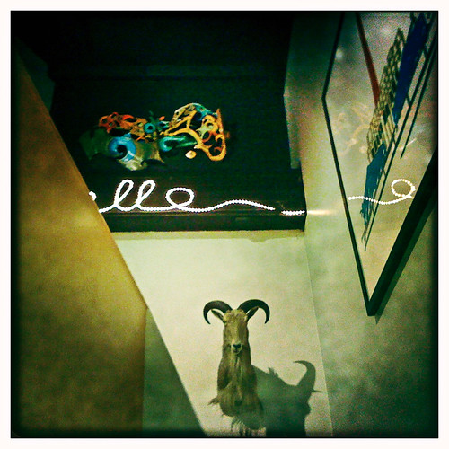
I like the lines and shapes in this shot. It has sort of a disjointed geometric feel to it that comes together into an interesting composition. The animal head and the colorful sculpture add points of interest, and help anchor me while I'm following the lines around. The bit of reflection on the frame is a nice added detail. Nice find, Stacey.
3 weeks to go...
~S
[title of blog] on flickr

I dropped a little gem in my ramblings about last week's 52 weeks wrapup, and thought it deserved its own blog post. Often times (especially on vacation) we want to take a photo of people in front of a building or other landmark. The problem is one of scale - the landmark is typically much larger than the people you want to photograph. How do you compensate for this?
Pretty easily, actually. Use a moderately wide-angle lens, frame your photo so that the landmark/building fills the frame (or however you decide you want it), then have your subjects move toward the camera until you get the framing you want on them (full length, 3/4 shot, head and shoulders, or in the extreme example above just the face). Make sure the people aren't blocking too much of the background - adjust your framing and position of necessary. Stop down your lens to a relatively narrow aperture if possible (f/11-f/16) to ensure enough depth of field to keep the people and the landmark in focus (the wide angle helps with this, too). Setting your focus to the hyperfocal distance will max out your depth of field and make this process easier, but if you don't have that figured out (or don't have a distance scale on your lens) you can pick a focus point about 1/3 of the way into your scene, that should cover it. If you can't use a narrow aperture, focus on the people and let the background go a little soft.
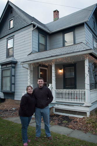
Just for comparison's sake, here's a shot without my big mug in the foreground:

You can see how small the people get as they get closer to the arch. If I had stood right next to the thing, I would have been about 5 pixels high in the photo. Not very memorable.
I think that most people sort of figure this out when they're at big landmarks on vacation (if for no other reason than it's easier to get a non-crowded shot when you're farther away), but knowing why it works lets you apply the same technique to more every-day type shots, like the photo of my wife and me in front of our house. It's a good thing to have tucked away in your photographic bag of tricks.
~S
[title of blog] on flickr
© 2010 Simon Hucko
Only a day late this week. Phew. This was the *only* photo I took last week. I thought about cheating and putting something up that I took earlier, because frankly this is pretty much a snapshot, but oh well. They can't all be winners.
Self shots like this are pretty easy to set up, especially if you have a remote (which I highly recommend). I set exposure manually and checked the histogram before popping the camera on the tripod. I guesstimated the hyperfocal distance and set that manually, too, so that everything would be in focus. The trick for these wide angle "people standing in front of stuff" shots is for the people to get as close as possible to the camera so that they fill more of the frame. If we had stood on the porch, we probably would have been about half the size, and our faces wouldn't have shown up very well in the photo. I raised the tripod up pretty high to eliminate some of the perspective distortion, so that the top of the house didn't converge too much. (I corrected it even further in Lightroom to help get rid of that "wide angle" look.) The 2 second timer on the remote let me get my hand back in my pocket after tripping the shutter. 6 shots later, we were done. Quick edit for contrast in color, then off to my parents for their Christmas newsletter. All told, it took less than 20 minutes from getting out the camera to clicking "send" on the e-mail. It's not award winning art, but it's a nice photo of my wife and me with our new house, and is something we'll be glad to have years down the line.
My pick this week is "Big skies over Manhattan" by chofler:
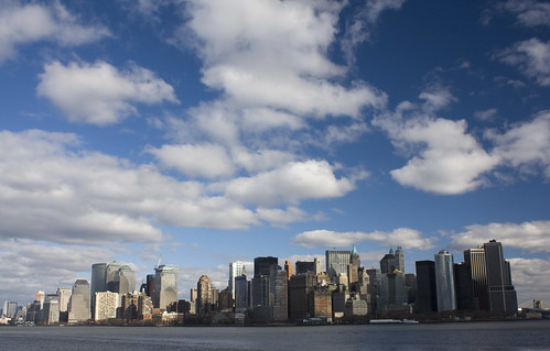
I really like where she placed the skyline in the image - the low horizon and wide angle really show off the clouds. There's an interesting play of light and shadow on the buildings, too, I'm guessing as a result from the scattered clouds. I think this would have even more impact printed large, as you lose a bit of detail at web res.
4 weeks to go!
~S
[title of blog] on flickr
© 2010 Simon Hucko
I don't have anything fresh for the blog this week, so it's time for a few winter/holiday related links! (Sort of like the dreaded clip-show on TV, only hopefully a little more rewarding.)
- The thermometer is plunging, and you might be worried about taking your camera out in the cold. Don't be.
- Around here, cold weather means snow. Learn how to keep it from fooling your camera meter.
- Shh! Here's the secret to shooting Christmas lights.
- Getting together with friends and/or family? Here's a few tips for capturing the event.
- Finally, if you're lucky enough to be getting away on a vacation, I have some thoughts on managing your vacation photos.
Enjoy!
~S
[title of blog] on flickr
© 2010 Simon Hucko
Suuuuper late this week, sorry everyone! I think Thanksgiving threw me for a bit of a loop. I should be back on track for the rest of the month.
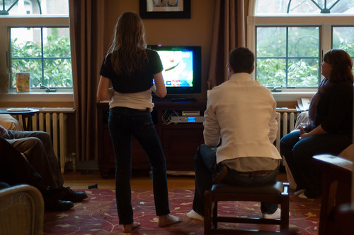
My photo this week was one of the very few I took on Thanksgiving. The light was bad (ie there wasn't much of it), so between that and the food/wine/family, I decided to keep the camera in the bag most of the day. It happens. I manged to grab this shot of everyone being entertained by the Wii. Nothing amazing, but it was a moment, and I think I captured it pretty well. Picking a white balance was a little tough, as it was mixed incandescent lamps and cool cloudy sunlight through the windows. I think I ended up somewhere between incandescent and daylight so that neither one was too far out of whack. It still looks mixed, but your brain expects it to, so it works. (I think. If you disagree, feel free to say so.)
This week's pick is "Hofler family Thanksgiving" by chofler:
This goes with my non-official Thanksgiving theme for the week ;) The title and description say it all - this is how her family does Thanksgiving. This is why I love phone cameras: it's so easy to share part of your life with everyone else. That voyeuristic (for lack of a better word) look into how other people see the world is very intriguing to me. Thanks for the glimpse of your holiday, Catherine. Looks like quite a feast
We're into the final month of the year. Hard to believe that 52 weeks is almost over - only 5 more to go! Let's finish strong :)
~S
[title of blog] on flickr
© 2010 Simon Hucko
We got some rain here last week. On the way into work one morning I noticed that the creeks had some good flow going, so I made a quick trip over to Ithaca Falls. I apparently underestimated just *how much* rain we got, because the falls were almost up to spring volume. Thanks to an up-stream breeze, I was able to get pretty close before getting blasted with spray. I set up the shot, shielded the camera, waited for a break in the wind (which never really came), and took the shot. I like the black and white on this one, but I definitely overdid it with the vignette. Sorry. If I ever print this (probably won't) I'll make sure to dial that way down first.
My pick this week is "Candid" by irv_b:
I think the best word to describe this photo is "tension." Instead of giving the subject "room to move" in the frame, he placed his face up against the left edge. The man's glance back over his shoulder adds some good mystery to the shot, and makes me wonder what caught his eye. The gritty black and white treatment completes the effect, giving us an image with a lot of intrigue. Nicely captured, Irv.
Thanksgiving this week here in the states - plenty of chances for you to take candids, portraits, and even food shots. Give yourself a little assignment for the weekend and see what you come up with.
~S
[title of blog] on flickr
It's about time to start thinking about calendars for next year. Calendars are a great, functional way to get your work printed and hanging on the wall. My wife and I typically do a "family" calendar with photos of us and our family/friends throughout the year. It's nice to have some family photos up on the wall/fridge that otherwise just sit on the internet or in a photobook on the shelf. We usually get these printed through Shutterfly, and they're not that expensive (around $20 plus shipping). The print quality is pretty decent, comparable to their books, and turn around is usually pretty quick.
I'm also going to throw together a "fine art" calendar with some of my favorite photos from the year. I did one this past year for myself and it was nice to have it hanging in the office - sort of like an 8x10 print that changes every month. I'm also planning on giving a few away as gifts, and might even run some sort of contest for one here on the blog. I'm going to give Mpix a try and see how they stack up to Shutterfly. The prices are actually basically the same (until Shutterfly runs a sale on theirs), so if the quality turns out to be better that may be the way we go for calendars from now on. I'm guessing it won't differ too much, but it never hurts to try.
If you're going for full-bleed photos (images covering the entire page with no border), do yourself a favor and crop them ahead of time. Even if I'm using a vertical image or two on a page, I'll be laying it all out to 11"x8.5" (landscape) in Photoshop and filling any blank space so that I won't have to mess with the online layout and cropping tools. Probably not necessary, but it gives me more control over formatting without being locked into one of their templates.
As usual, I don't get paid for my recommendations or reviews (but wouldn't that be nice?), so no pressure to use Shutterfly or Mpix. If you have another printer that you like feel free to share it in the comments.
~S
[title of blog] on flickr
© 2010 Simon Hucko
My photo this week was a fun find on one of my lunchtime walks (yes, I carry around my huge effing tripod - you never know). The little 6 inch fall of water was nothing spectacular, but for whatever reason the wake (?) off the bottom formed a big triangle in the creek. I got this detail shot and then took a wider one showing the whole thing, but I think the close shot was a much better photo (the wider one looked more like a snapshot to me). The 1/2 second exposure left some interesting detail in the water. I usually drag the shutter out and blur the crap out of these types of shots, but it looks like I'll have to do some experimenting with shorter exposures. (Not sure why I chose 1/2" here...)
My pick this week is "Femme Mosaic" by irv_b:
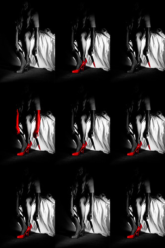
I'm not usually a selective color fan, but I really like it here. The mosaic and different coloration of each frame gives it a somewhat pop-art feel (a la Andy Warhol), but the gritty subject matter and the hard lighting definitely speak to the film noir theme he was going for. I suggest viewing it large to see all the subtle variations. Very nice, Irv.
I think I'm going to drop the themes for the rest of the year, as I'm running out of ideas. Any photo will do - show us what you've got!
~S
[title of blog] on flickr
Just a few thoughts for those of you who use programs like Hipstamatic et al to add lomo effects to photos taken on your phone. The vintage lomo "film" look is in right now, and these photos add a bit of grunge and randomness to the sterile, predictable world of digital photography. It's also a good way to mask the shortcomings of the average phone camera, although they are getting better.
The danger of processing every photo you take like this is that, a few years from now, all of your memories are going to be green and grainy with a heavy vignette. Not exactly how you want to look back on Christmas 2010... There are a couple ways around this. Vignette, the camera app I use on Android, lets you automatically save the original photo along with the edited version. I shoot everything 2 for 1 this way, and just delete the originals that have no future value. Every so often I'll back them up to my computer. If your camera app doesn't let you save the original, some let you edit photos that you've already taken on your phone. You can shoot with the normal camera app and then re-edit the photos later before sharing them. This is a bit of a pain, but at least you'll have a "clean" copy of your photos.
I bring this up because I find myself relying on my phone more and more as my point n shoot camera. A lot of times I'll choose to leave the camera bag at home, knowing my phone can capture a decent image if I need it to. I like playing with the different processing effects, but it's nice to know I have a version I can edit normally and print or hang on to for the future.
Do you use your phone as a point n shoot? Do you process everything with a camera app and share from your phone, or do you take photos and put them on your computer?
~S
[title of blog] on flickr
© 2010 Simon Hucko
I'm writing this post to expand on something I said in the comments of Monday's article ("Gotta Shoot Something"). If you haven't read the previous article, I suggest clicking through and having a go before you continue here.
If I had to compare photography to a sport, I'd say that golf serves as a good analogy. Golfers carry heavy bags full of gear, half of which is probably unnecessary. (If you golf, when's the last time you used your 4 iron? 6 iron? 3 wood?) Golfers are notorious for blaming their gear for bad performance, and will try anything (extra-long tee's, super-flight balls with some crazy new synthetic core, different gloves, "enhanced sweet spot" drivers, etc.) to shave a stroke or two off of their handicap. Weekend warriors are more than willing to open their wallets for a "magic" fix - something that will improve their game overnight, just in time for their Saturday morning skins game. The sad truth is that most golfers aren't nearly good enough to notice a real difference between an "ok" club and a top of the line custom-fit titanium behemoth. Sure, they might hit the ball a little farther, but with no consistency or control that extra bit of distance doesn't really matter. That's not to say that the gear is trivial - the pro golfers use the latest and greatest equipment in order to stay competitive. But the pro's also spend hours a day on the driving range, around the practice green, in the gym, studying their swing, analyzing the next course they will play, etc. All that extra work is what separates a professional from the average country club chump.
Let's bring this back to photography. The latest and greatest gear won't make your images any better, in the same way that a new golf club can't fix your swing. What makes the biggest difference to your photography is the time you spend practicing. Taking a photo walk with one lens is like going to the driving range with a bucket of balls and just your 7 iron - by the time you're done, you have a better feel for that lens and the images you can make with it. Spend time analyzing your images and study the work of others to develop your style and sense of composition. The photo above was basically a "grab shot" as I was walking around one day, but gave me a chance to work on my post processing. Shoot regularly to exercise your craft and your creative eye, even if you don't think you will be making amazing images. Practice processing your images to get different looks, so that you can apply them in a subject-motivated way in the future. Don't be afraid to make mistakes - even the top ranked professional golfers don't hit it down the middle of the fairway every time. Learn how to work through and overcome those mistakes, then move on to the next shot.
That's it for the "gear isn't everything" rants for now. I hope I didn't lose too many of you with the golf analogy... Got some good feedback on Monday's post, and would love to hear more from you :) Back to your regularly scheduled blog next week.
~S
[title of blog] on flickr
© 2010 Simon Hucko
I'm not thrilled with my photo this week, but I was actually excited to take it, so I consider that a win. I've been getting more and more interested in long exposures, and am strongly considering a 10 stop ND filter. This photo has some issues (a bucket in the middle of the dam, blown spots in the sky from the setting sun poking through the clouds), but I think there's a lot of nice movement between the water and the clouds. If the weather around here continues to produce low, fast-moving clouds like this I may have found my saving grace to tide me over until the snow starts. Things are continuing to improve this week photo-wise, so I'm happy to be done with this fall flop (at least for now).
My pick this week comes from DebPaul2010:

First, I'd like to say welcome to Debbie - she found us a week or so ago. Always happy to have new members, and even though the project is almost done for the year, I'm looking forward to seeing what she has to post. I chose this image for the lighting. Because the scene is back-lit with warm sunlight, there is an interesting play between the golden sun and the cool shadows. Despite being back-lit, the exposure is well balanced and gives a lot of nice detail and color on everything in the shot. The cemetery is an interesting take on the theme of "time." Nice shot, Deb.
No theme this week, just get out and shoot something :)
~S
[title of blog] on flickr
© 2010 Simon Hucko
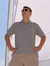
[Eek, snow! I was digging through my photos for a shot of me with my camera, and this is the best I could find. Perhaps it's time for some more mirror portraits...]
I tagged this post with "gear," but it's more an anti-gear kind of discussion. I'll start with a story.
I was walking around campus the other day and wound up seeing another photographer. We made the usual exchange - smiled at each other, and then checked out what gear the other was using (sort of like dogs sniffing each other's butt). He saw my camera and said "argh, Nikon?!" I shrugged and responded "gotta shoot something." I didn't really give much thought to that statement before making it, but reflecting on it later I realized that it's actually a rather profound thought.
Photography is an interesting art because it relies heavily on technology and gear in addition to artistry and creativity. It takes a lot of stuff to make a photograph, especially a digital one - at the very least you need a camera, a lens, a memory card, a computer, photo editing software, and a photo sharing site. Because the art relies so much on the gear, people tend to associate the gear with the images that they get. How many of you have thought "I'd be a better photographer if only I had a [insert new lens/camera/accessory here]?" I'll admit it, I spend my fair share of time keeping up with the latest and greatest, and I've even caught myself thinking that my photos might get better if I had a newer camera. The sad reality is that they won't. (The only legitimate excuse I have there is needing higher clean ISO and/or faster zoom lenses for theater photography.)
Since photography gear is relatively expensive, the decision to buy into a particular brand is not trivial. Once people sink a few hundred dollars into something, they start develop a sense of loyalty to it. According to a psych class I took in college, people feel the need to justify their decisions, and will actually feel more positively about something after investing time/money/emotions in it (see cognitive dissonance). This unfortunately starts to breed fan boys - people who believe that their brand is the best, and that you'd have to be a fool to use anything else. People like the photographer that I had my brief exchange with. I think he was just joking a bit and making conversation, but the sentiment is definitely out there.
My point here is not that gear isn't good (hey, if the gear didn't matter then the pro's wouldn't spend $5k+ on a DSLR), but that it isn't everything. This post was inspired by David duChemin who recently announced that he would be transitioning over from Canon to Nikon (see his post here). To quote David, "Gear is Good. Vision is Better." It's not what you shoot with, it's what you shoot with it that counts. You have to choose a camera to take photos with - whether it's a $10 disposable film camera or a $30,000 digital medium format camera will depend on your budget and your vision. Cameras are just tools, and you should use the tools that will help you best realize the image that you want.
Worry less about the gear, and more about the jaw-dropping, inspiring photos that you make with it ;)
~S
[title of blog] on flickr
As you may or may not know, November is National Novel Writing Month (or NaNoWriMo). The goal of NaNoWriMo is to write 50,000 words of a novel between November 1st and 30th. That works out to something like 1,667 words/day, which is no small task (especially if you're not usually a writer). I am not much of a writer, and I don't really have any interest in writing a novel, but I like the spirit of the challenge. It's similar to the 365 projects that photographers take on in that it forces you to be productive every day, even if you're not feeling particularly creative or inspired.
When I saw the NaNoWriMo tags popping up on twitter again, I started thinking about a good photography project to go along with it. I finally had my "ah hah!" moment. If a picture is worth 1,000 words, then the photographic equivalent of NaNoWriMo is 50 images that come together to tell a story (50 images x 1,000 words each = 50,000 words). This means that November is now also National Photo Essay Month, or NaPhoEMo (doesn't have quite the same flow as NaNoWriMo, but I think it works).
Sadly, this brilliant epiphany came to me a little late for me to execute it within the month. 50 images in a photo essay is a lot, and for each of them to be meaningful will require a lot of planning and editing. I'm writing about it here to get the idea down for next year, and to hopefully inspire a few of you in the process. I'll make a much bigger deal about it leading up to November 2011, and maybe we can get a little group going.
What do you think? Is NaPhoEMo the next big thing?
~S
[title of blog] on flickr
© 2010 Simon Hucko
I had every intention of posting a nicely balanced photo of our lit pumpkins on the porch this week, but I missed the deadline. We didn't carve our pumpkins until Sunday, and by the time the light was right the trick-or-treaters were out in force. I still plan on grabbing the shot sometime this week - better late than never, right?
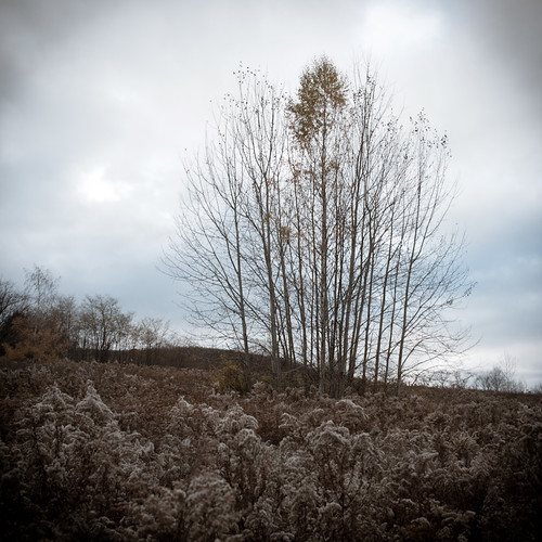
Instead, I give you this dreary and bleak outlook on the death of fall. I feel like I dropped the ball a bit on autumn photos this year, and so when I saw this scene last week I just had to stop and capture it. I think it pretty well sums up my feelings about the weather right now - moody and depressing. Trying to get over it and find things to photograph to carry me through the end of the year.
This week's pick is "Flasher" by slithy-toves:
Very apropos for the Halloween theme, especially with the little flecks of orange in the photo (some weird sort of flare?). The lensbaby adds a nice creepy blur to it, which is very fitting of the subject. Spooky stuff :)
In honor of daylight savings time ending this weekend here in the states, this week's theme will be "time." Show me what you got.
~S
[title of blog] on flickr
© 2010 Simon Hucko
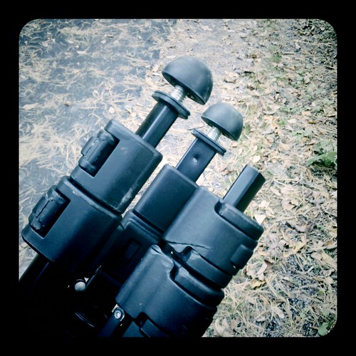
One of the biggest pitfalls for new photographers is choosing a tripod. Most photographers don't even buy a tripod to start out with, but eventually we all get to a point where the idea of a tripod is appealing - self portraits, the family Christmas photo, panoramas, long exposures, HDR bracketing, macro photography, etc. You hop online and look for some tripod recommendations, but everything you come across seems pretty expensive ($200+ for a tripod?), so you head over to the local Best Buy or Ritz and fork over 40 bucks for a cheap aluminum and plastic model. It has 3 legs, a camera mount, and is nice and light and compact. What more could you need? You chuckle with self-satisfaction at the people who are shelling out big money for expensive tripods. Suckers.
Then you start using your tripod. The second or third time you set up the legs and tighten them down on the center column the plastic screw snaps. Oh well, you always set them up wide open anyway, no need for a screw. You start keeping the tripod in your car so you can grab it when you need it. A few weeks later you re-adjust your seat and hear a crunch as you chip the plastic clamps on one of the legs (you forgot the tripod was on the floor behind your seat). No biggie, just a little scarring, and you can bend the leg back into shape so that it'll slide right. A month or so after that you're out on some rocks photographing a sunset. The tripod isn't perfectly level, and a gust of wind comes along and almost topples your camera over (good thing you were there to catch it). OK, you'll just stay within arm's reach of the tripod at all times. Finally, a year later, you pull your tripod out of the car again and notice that one of the feet has broken clean off. Game over.
This is pretty much what I went through with my first tripod (pictured above). I was never really happy with it, and regretted the purchase almost immediately after I started using it. The general rule for tripods is:
Lightweight, Sturdy, Inexpensive - pick two.
Fortunately, before my POS big box special finally broke, I picked up a used tripod on Craigslist. It's an old Bogen monster with a heavy duty 3-way head on it (I don't remember the model numbers). I got it for $60 (super inexpensive) and it's rock solid, but also weighs about 15 pounds (see the rule above) and is only 2 sections so it's about 3 feet long when collapsed. Despite the amount of hiking I do, I can live with that for now - it's easy enough to throw it over a shoulder. Some day I'll get a fancy carbon fiber tripod with a nice light ball head (light and sturdy, and definitely not inexpensive), but that'll have to wait.
If you're just starting out and haven't bought a tripod yet, I suggest saving yourself the agony of the cheap tripod. Even if you don't see yourself using a tripod that often, spending $100 once on a tripod that will last for a lifetime of light use and that you don't have to worry about breaking or knocking over is a much better idea than spending $40 several times on cheap tripods that could lead to other gear damage. Notice I said "light use" - if you want something serious and sturdy, spend the same $100 on a rock solid used tripod. It may be heavy, but you can beat it up and place it down just about anywhere (on rocks, in creeks, in a tornado, whatever) without worry. If you have the money, spending a few hundred on light weight sticks and a few hundred more on a silky smooth ball head will make your life a lot easier and more enjoyable. Hey, no one ever said this stuff was cheap. Think about it as buying another lens.
Have you fallen victim to the cheap tripod? I read a story the other day about a photographer whose camera fell down a cliff because of an unsteady tripod (don't believe the "protective filter" BS, that UV filter did nothing for the lens). Share your horror stories in the comments!
~S
[title of blog] on flickr
© 2010 Simon Hucko
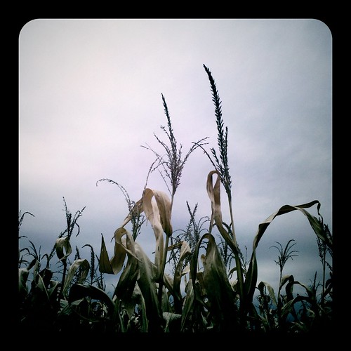
This week was a pretty blah week for me photographically. The weather was blah, the leaves are mostly gone in the places I usually shoot, I was busy with life and didn't have much time for photography, etc. So, the best I could do this week was a cell phone shot of some dead corn against a slate gray sky. Enjoy ;) I'm going to make every effort to take some photos that I'm proud of this week. Hopefully that'll pan out.
My pick this week is "Splash" by irv_b:
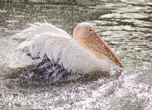
For best effect, click here to see it larger. Really digging how the droplets were frozen by a fast shutter speed. The exposure is spot on, too - plenty of detail in the white feathers of the bird. And, for the icing on the cake, the bird is looking directly at the lens. Excellent capture, Irv.
The theme this week is "Halloween." Plenty of options here. 10 weeks left, folks, hop back in and finish strong!
~S
[title of blog] on flickr
© 2010 Simon Hucko
You may have noticed the little signature that has started showing up on all of my photos. Notice I call it a signature and not a watermark. What's the difference? Glad you asked.
Traditionally, a watermark is a security measure designed to authenticate a particular document. In the case of photography, a watermark is generally used by a photographer to prevent image theft. This can be a real concern - if you make your money selling images, what's to prevent anyone from scraping an image off your website and using it for their own means without paying you for it? The honest answer is: nothing. Even embedding images into a flash slideshow doesn't prevent someone from doing a screen capture and having a perfectly good web-res image to use. So by watermarking an image, at least you'll get credit for it when it gets scraped and you can use that as ammo to get paid (or at least get the image taken down), right?
Not necessarily. Turns out anyone with a copy of photoshop can pretty effectively scrub your little watermark right out of the image (even more so with the new content-aware fill in CS5, which is truly an amazing thing to behold). Some photographers counter this by placing a rather large watermark right in an important part of the image, making it extremely difficult to crop or clone out. (Remember, nothing is impossible...) The net result to the viewer is something like this:
image courtesy of Matt Beaty
This sort of big watermark, even if it's mostly transparent, is an immediate deal-breaker to me. Why would you share your image if you're going to throw something huge and distracting right in the middle of it? Makes no sense.
"OK Simon, so if your little signature isn't protecting your photos, why is it there?" Branding. Most of my photos are up on flickr with a Creative Commons license, which basically says that people are welcome to use my images for non-commercial purposes as long as I get credit for them. My images do make it onto people's blogs from time to time, so having my signature on the image helps to identify it as mine. (It would probably be better if you could actually read my signature, but that's not how I roll.) Because it's not distracting from the image, people are much more likely to leave it there rather than trying to crop or clone it away. It also means that people who are familiar with my work will recognize the signature when they see it, helping to build the brand that is Simon Hucko. It's not a very big deal at the moment, but it's laying the groundwork for future growth (ie if I have images in a gallery, send a bill, sign a book, print a calendar, hand out business cards, etc).
What are your thoughts on the situation? Should photographers watermark their images? Is my signature still too distracting and/or pointless? Should I be doing more to prevent image theft? Comment and let me know.
~S
[title of blog] on flickr
© 2010 Simon Hucko
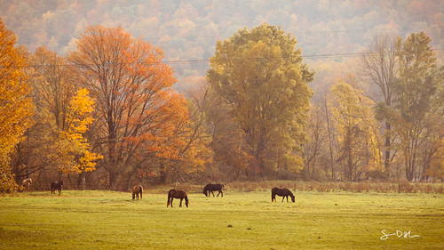
Well, we managed a few more photos this week, so I guess I'll continue. I know there are some lurkers out there who haven't been posting lately, and I encourage you guys to jump back on. 11 weeks left - you can do it! Plus, with fall here and the holidays coming, there are plenty of photo opportunities, so it shouldn't be hard to shoot something every week. Even a quick photo with a cell phone is better than no photo as long as it speaks to you in some way.
My photo this week is of a scene that I pass every day on the way to work. I love this field with the horses in it, and so often it screams out to me "take a photo!" I don't usually stop (mostly because I don't have a long enough lens to do it justice), but the other day the horses were closer to the road and right up against the changing trees. The power lines are a bit of a bummer (and another reason that I don't photograph this field much), but I can live with it.
My pick this week is "norwich cathedral" by irv_b:
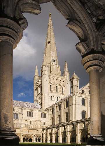
There are so many great things going on with this photo, starting with the great use of framing. From the description: "...I added a bit of flash to lift the details from inside the arches." Great idea, I like the extra bit of detail that you get in the foreground this way. I also like the lighting on the building - sunlight on the subject with moody clouds in the background is one of my favorite things. Great photo of a lovely spot.
This week's theme is "Fall." For the seasonally challenged, you can always tackle a different meaning of the word ;) And, as always, the theme is just a suggestion to get your creative juices flowing. Feel free to post any photo that you want. I hope we'll get a few more of you to come back into the fold this week.
~S
[title of blog] on flickr
I had the opportunity to make a few photo-related purchases for my birthday recently. Something that I've had my eye on for a while is a Lensbaby. Rather than drop $200+ on one of the new ones that I may end up not liking and never using, I opted for a used copy of the last generation of Lensbaby (Lensbaby 2.0). It's basically a Lensbaby Muse with a double glass optic built in, which I figured was a good (and inexpensive) way to get started with the whole Lensbaby thing.
First off, I will say there is a bit of a learning curve. From a technical standpoint, all Lensbabies are manual exposure only, so if you're not comfortable with that you may want to steer clear (the point is to be inspired, not frustrated). Focusing accurately can also be a little tough, and I wound up shooting multiples of most subjects until I got what I was after (image review is helpful for this). From a creative standpoint, there are certain shots and effects that work better than others with this lens, so it takes a bit to get a handle on how to best use it. Of course, there's no *wrong* way to use it (that's kinda the point), but certain looks were more appealing to me than others.
Rather than give a technical review, I'm going to go through a series of shots I took showing the different looks I was able to get from the lens, and you can draw your own conclusions from that. I think that's more meaningful, anyway.
The classic Lensbaby look:
Focus in one part of the frame, everything else is blurring away from it. Because the blur is directional it takes on more of a zoom quality than an out of focus quality. This can be very effective in putting the emphasis on your subject. It also gets pretty old, pretty quickly (in my opinion, anyway), so I started looking for other ways to use the lens.
Tilt-Shift:
A Lensbaby is a pseudo-tilt/shift lens, but the field curvature of the optics messes with that and gives you a round sweet spot instead of a plane of focus. However, judicious framing and cropping can give you that tilt-shift look at the expense of some pixels. This is something I have to explore more.
Shallow Depth of Field:
Just glancing at this photo, it looks like a standard shallow depth of field image. Closer inspection of what is and isn't in focus reveals that there is indeed some Lensbaberie going on, but it's a different feel from the standard Lensbaby look. This is entirely composition and subject dependent - you need to find the right situation to make this work.
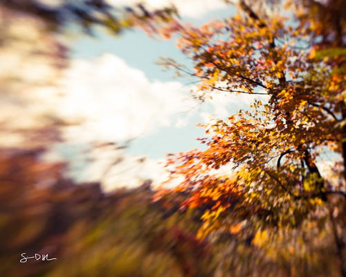
Lomo:
This is the look I see myself using most often - a reasonably sharp center blurring away at the edges. The square crop and vignette complete the illusion, and bingo bango - digital Holga. Seems to work best with mostly flat subjects at far distances.
Portrait:
This lens has some good potential as a portrait lens. It certainly puts the focus on your subject's face, and leads to a nice blur in the rest of the photo. I don't do a lot of portrait shots, but I'll have to play with this more. Maybe I'll do a family portrait series over the holidays with it. (Maybe.)
Overall I'm pretty happy with my purchase. Like any specialty lens, it's not something I'll use every day, but it's small and light enough to have earned a permanent spot in my bag. I think it will be a great cure for the blahs that settle in from time to time, and just might save my sanity this winter when the world gets gray and ugly. It also will be fun to pull out for some "different" shots at things like weddings, or on vacation at those touresty areas. And if nothing else, it's a good talking piece with other photographers.
~S
[title of blog] on flickr

Since I'm reading through it for the second time, I figured I would write a little review about "Examples: The making of 40 photographs" by Ansel Adams. (Amazon). Ansel Adams is probably the most well-known American photographer, and is most famous for his stunning black and white images of Yosemite (and black and white landscapes in general). If you aren't aware of his work, I highly recommend checking him out (wikipedia, Ansel Adams gallery).
The reason that I love "Examples" so much is that it's almost like having a conversation with Adams while flipping through his portfolio. Each photo is printed and then followed by 2-3 pages of discussion by Adams about the image. He includes as much as the technical information as he can remember (camera, lens, filter, film, exposure, etc), but also goes beyond the "how" into the "why" - why he was motivated to take this image, what the circumstances surrounding it were, how his feelings about the image have changed over time. He also randomly includes his thoughts about the art and craft of photography (at one point he even mentions how he is excited for the development of digital image capture). While the technical information is interesting to me, it's these little nuggets that really make the book a must-read.
Best of all, it's not that expensive to buy (currently $26.39 on Amazon). It would cost you more to buy postcards of the 40 photos in the book. If nothing else, this would be a good one to add to your holiday wishlist.
~S
[title of blog] on flickr
© 2010 Simon Hucko
I finally bit the bullet and used some of my birthday money to get a Lensbaby. I have a review coming soon, so I won't talk too much about it here. Suffice to say, those things are super fun to play with. I went exploring with it the day it arrived, and came up with some good stuff. This shot really takes advantage of the Lensbaby blur to focus in on the subject. The black and white should come as no surprise to anyone. Keep an eye on my photostream this week for some more shots, and on the blog here for the review.
My pick this week is "angles" by irv_b:

Great abstract image here. I like the curve set against all the hard lines and angles, it makes for an interesting composition and keeps my eye bouncing around the frame. Nice find, and well captured.
No theme this week. I may be discontinuing these wrap up posts here and on the flickr group unless people start submitting more, as it makes no sense for me to make a "pick" out of the one or two submissions for the week. If you want to see this continue, submit an image. If not, we can part ways on this project. It's in your hands, guys.
~S
[title of blog] on flickr
![[title of blog]](https://blogger.googleusercontent.com/img/b/R29vZ2xl/AVvXsEhJ8bvx_9_zOAREbXcrJRML7aVvJMbb90IYYYuyti384jeZHYQ9t8MK6_Kpt_1P4-pZw-QfF9kh4Sqci0vbopzLme862PPhuyPJcc7pRLUW1K1aNzts5YzuXIhgonq66MpjJCqfiWtfwUw/s1600-r/waterfall.png)