skip to main |
skip to sidebar
© 2009 Simon Hucko
I know I've drooled over RAW before, but I found a nice concrete example of why I'm never going back to JPEG while I was editing photos from this weekend.
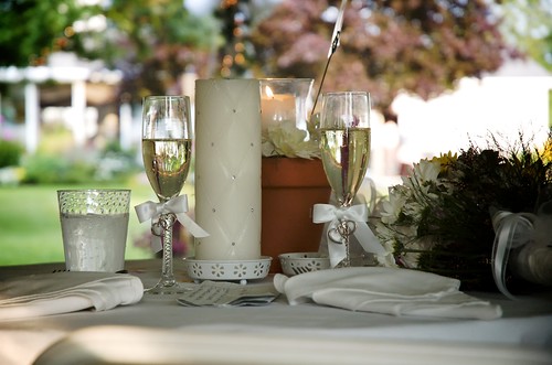
I like today's shot. Nice color, pleasing bokeh, captures the feeling of sitting at the head table at a wedding. Out of the camera, it looked like this (straight RAW conversion):

© 2009 Simon Hucko
Underexposed, muddy, color is off - not such a nice shot. But, because I was shooting in RAW, I had some wiggle room and was able to save it. I set the white balance from one of the napkins, boosted the exposure, tweaked the levels to add some contrast, applied some noise reduction and sharpening, and added a little vignetting. Only a minute's worth of work, but it made a huge difference in the final product.
I try not to rely on this, but it certainly can help save a shot you like that's a little off.
__________________________________________________
Tip of the day: find something neutral in a picture to help set the white balance. Weddings are especially good for this because of all the white. (Just make sure that it's really white and not ivory/cream/champagne/whatever, or you'll have an unhappy bride on your hands)
~S
[title of blog] on flickr
© 2009 Simon Hucko
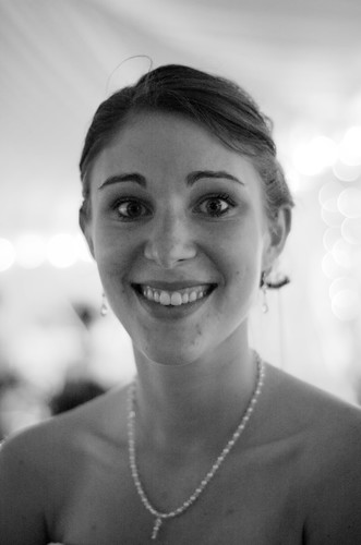
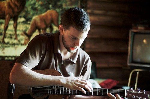
While editing photos from this weekend I came across a portrait I had taken of the bride. I was shooting available light in the reception tent at dusk, and so all I had to work with was a little bit of sunlight and the christmas lights and candles that had been lit. Even at ISO 800 f/1.8 1/40th (the limit for my setup, as it doesn't handle high ISO very well) things were dark and underexposed. I tried pushing the exposure, but couldn't get it very far before it got too noisy for comfort. See the original color image below:

© 2009 Simon Hucko
I decided to try converting to black and white. People tend to be more tolerant of noise when the image is black and white, probably something to do with the notion of grainy black and white film. After conversion I was able to boost the levels a little and with some noise reduction got a usable portrait. It probably wouldn't make a huge print, but it's good enough for screen viewing, and if you really wanted you could squeeze an 8x10 out of it.
Converting to black and white is also a good way to overcome color casts and fringing/chromatic aberration that you can't easily correct in post. So remember, when all else fails, try black and white.
~S
[title of blog] on flickr
© 2009 Simon Hucko
Had a great time at the wedding this weekend - nice ceremony, and a fairy tale reception under a big white tent in the garden. I came back with almost 500 shots, which I pared down to around 100 to edit for friends/family. I'm only about halfway through those, but I took the time to pick a few of my favorites and post them to flickr.
Set here.
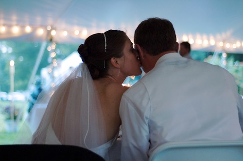
I tried my best to follow my own advice, and while I didn't always succeed (it's easy to get caught up in the moment and take 200 pictures of the bride and groom on the altar...), I think I managed to capture some unique shots. The one above is probably my favorite from the day. We ended up behind the sweetheart table because of the layout under the tent. When they finally sat down to eat after visiting with everyone, I managed to capture their quiet moment together (without intruding).
© 2009 Simon Hucko
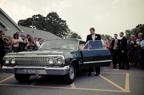
This one is a close second. I saw this sweet ride and immediately envisioned this shot. While everyone else lined up for bubbles, I parked myself by the front corner of the car with my zoom at its widest setting and waited. I got nice and low, and captured the length and lines of the car and the happy groom getting in to drive away with his new wife. After reading a tutorial on a simple cross-processing technique yesterday (more to come on that), I went for the vintage feel to compliment the vintage car.
All in all, a great weekend with some great times, great friends, and (I think) great images.
~S
[title of blog] on flickr

© 2008 Claire Voelkel
My wife and I are going to a friend's wedding tomorrow, and I plan on bringing my camera. I want to take some good pictures, but at the same time I don't want to be "that guy with the DSLR." Here's a few tips for getting the most out of attending a wedding with a camera:
- Let the pro do their job. Couples pay a lot of money for a professional to come and shoot their wedding. Whatever you do, don't distract them or the people they're shooting for any reason. You're there as a guest to have fun, not to ask questions about how much their gear costs or whether Canon or Nikon is better. (The answer is Nikon, obviously.) Be wary of shooting near them - people see multiple cameras and get confused about where to look. You don't want to be the one that screws up the family portrait.
- Take unique pictures. The professional has a list of must-have shots, and at the end of the day you're not going to be able to top anything they take. They have the gear, the access, and the experience. So focus instead on things that the photographer won't have. The photographer will be mainly focused on the bridal party and the immediate families, so you should look for other opportunities. Get a shot of the bride's friend crying during the vows. Catch the groom's aunt laughing at the toasts. Find stories happening while the bridal party is doing formal portraits. This way, you stay out of the photographer's way and produce shots that the couple will appreciate.
- Have fun! You're there to enjoy the wedding and celebrate, not to be a photographer. Take some pictures, but don't forget to experience the wedding. When someone asks "how was it?" you shouldn't have to say "not sure, haven't looked at my photos yet."
- Only pass your best shots on to the couple. Getting pictures from guests is nice. Getting 700 nuked flash snapshots... not so much. Find those unique shots and share those.
___________________
Thanks to Claire Voelkel and Matt Mendick for today's photo. Check out Matt's flickr photo-stream.
~S
[title of blog] on flickr
© 2009 Simon Hucko
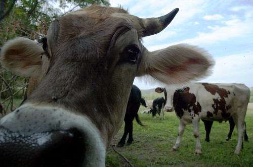
Zoom lens 101: You see a scene, but only want to capture part of it. Zoom in, and voila. This is very useful, especially when photographing something where you don't have a lot of room to move around.
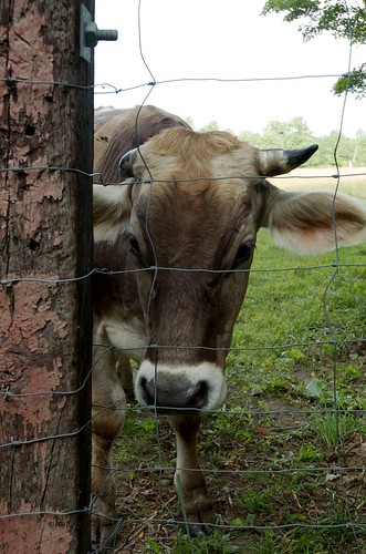
Zoom lens Advanced: Deliberately use your zoom to influence the perspective of the picture. I do this a lot when photographing animals - I set my zoom to a wide setting and hold the camera close and below their eye level. It gives a very unique perspective that you don't usually get in person. For the shot above, I employed this technique to capture the bull. My lens was literally inches from his nose, somewhere my face has never been, and it produced a dramatic, almost comical effect. For the shot below, I shot at a more 'normal' focal length, resulting in an image that looks very natural:
© 2009 Simon Hucko
Same bull in essentially the same place, but two very different feeling photographs. It's not the exact same shot because I wasn't thinking about this as an exercise at the time, but I think it illustrates the point well.
Wider angles will really emphasize depth and distance from the camera. In some cases this is desirable, but in others (portraits, for example) it can result in unpleasant distortions of the subject. Telephoto lenses are said to "compress" distances, and will produce a flatter looking image. This is generally considered more flattering when photographing people. It can also be used to compress a landscape with a lot of depth to emphasize the lines (a series of rolling hills, for example).
If you haven't played around with this before, I suggest you give it a try. Find a subject that won't run away from you. Set your zoom to its widest setting and get in close so that the subject fills the frame. Grab a shot. Zoom in a little, and move back so the subject is the same size in the frame. Grab a shot. Repeat until you're at your longest focal length. (You can even switch lenses if you want to experience the full range of your kit) Notice what effects the focal length had on the subject and the background.
Next time you're out shooting, try to use focal length as an artistic tool, not just a way to frame the scene.
~S
[title of blog] on flickr
© 2009 Simon Hucko
Today's post is about reducing camera shake to get sharper pictures. The easiest and best way to accomplish this is to use a sturdy tripod and head. However, you can't always carry a tripod with you (and it can be a real pain to lug around), and the good ones tend to be very pricey. Here's a few steps you can take to improve your hand-held photography:
- First and foremost, make sure that you are holding your camera correctly. Here's a short video on how to hold your camera from Chris Marquardt (Tips From the Top Floor). The key is to support your camera with both hands, and to keep your elbows in and as close to your body as possible. That will help you keep it stable while you shoot. This is especially hard when shooting vertically (portrait) - make sure you don't let your elbows go flying out everywhere when you turn the camera.
- Another very important step is to make sure your shutter speed is fast enough. Generally, you should avoid shooting slower than 1/(35mm effective focal length) - ie a 50mm lens on a crop sensor dslr is equivalent to a 75mm lens on a full frame camera, so you won't want to shoot slower than 1/80th or so. This can be pushed a little slower with good technique, but your rate of blurry shots will increase dramatically the slower you get. Open your aperture or increase your ISO if possible to get a faster shutter speed.
- If you're lucky enough to have some sort of image stabilization on your camera/lens (VR for you Nikonians, IS for the Canonites, sometimes OS for other brands), you can push the above rule by an extra 2-3 stops.
- Find additional support. Lean your body against a wall, rest your elbows on a table, or find some other way to add support from your environment. With solid holding technique, this added stabilization can buy you a stop or so of shutter speed.
- Make a "string tripod" (tutorial here). Not as good as the real thing, but it's lightweight and very portable - you could easily keep one in your camera bag.
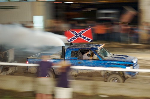
- Pan your camera (only works for a moving subject). Today's photo (above) was taken with a 1/10s shutter speed. Normally that would result in a blurry mess, but since I was panning with the car my constant body motion helped prevent some jerking or shaking.
______________________________________________________________
Don't forget to check out [title of blog] on flickr!
~S
© 2009 Simon Hucko
I decided to create a [title of blog] flickr group as a companion to the blog. I'm hoping that this will encourage readers to share their images for comments and critique and discuss what I've written here. I also hope that people will post some questions or interesting bits of news/discussion there that I can work back into the blog.
The group is open to anyone with a flickr account (which are free), so please come on over and invite your friends!
~S

© Stuck in Customs, used under Creative Commons license
Today's link is to an excellent HDR tutorial from the Stuck in Customs travel photography blog. HDR, or High Dynamic Range imaging involves merging multiple photos of different exposures to increase the dynamic range of a photograph. A digital sensor captures between 4-6 stops, depending on the camera and the ISO setting. The human eye can perceive somewhere in the neighborhood of 11 stops. As a photographer, we often have to make the decision on what is the most important part of a scene, and resign ourselves to losing some detail outside of that range. With HDR, you can capture all of that detail in several different exposures. You can then merge that information into one photograph through a process known as tone-mapping.
There have been a lot of HDR images produced recently as the technique has gained popularity and ease of access (the necessary software is becoming better and cheaper). However, most people go crazy with it when they first start, resulting in overly saturated poorly tone mapped halo ridden surreal cartoonish images. (Go to flickr and search for HDR to see what I mean.) However, when done correctly, HDR can really bring a lot of detail into your photography, and the tutorial linked above does a good job of not overdoing it.
It's a fun technique, and with a lot of patience and practice can produce some beautiful images. I encourage you to give it a try!
~S

We all have been part of an awkward photo. Awkward Family Photos is a blog dedicated to bringing some of the most uncomfortable, creepy, and downright hilarious pictures to the public eye. Photos are submitted by people like you, and run the gamut from poorly staged professional portraits (like the one above) to candid photos capturing awkward moments to hilarious prom pictures, and much more. Definitely worth a read. Subscribe to the RSS feed here
Edited for grammar. Way to proofread...
~S

© 2009 Simon Hucko
Have you ever been really excited about a shot, only to open it up on your computer and discover that it didn't turn out at all how you expected? Sweeping landscapes become flat and boring. Objects in the foreground suddenly become a lot more intrusive than you remember them being. Some dynamic element suddenly seems static and uninteresting. Why does this happen?
The answer, simply, is that your brain is too smart for its own good. When you are looking at a scene, your perception of what's going on is influenced by your brain's representation of everything involved. Your eyes may not be able to see the entire stage at a concert at a given moment, but your brain knows what is there and completes the image in your mind, so that you barely notice the head that's blocking a part of your view. Your depth perception influences your interpretation of a countryside view, making it seem vast and engaging rather than the flat 2D image that your camera will capture. It's very easy to overlook flaws or distractions in the scene because that's what your brain does automatically.
The key to representing your vision in a 2D medium is to overcome your mental representation of a scene and actually see what is present in your viewfinder. You may perceive a landscape as having great depth, but if you close one eye and really look at what's in front of you, it may fall flat. There are ways to restore this feeling of depth, like making sure you have 3 planes in your photos - a foreground, middle, and background. Giving the viewer a reference to the distances involved can add depth back to your photo.
In the case of obstructions, something like a fence or a small building may not even register when you look at a scene because you have a working knowledge of what else is present. Not only does photography compress everything to two dimensions, it also removes the time element from a scene. This can greatly reduce the context of a given image, and it needs to be able to stand on its own without relying on prior knowledge of the subject. This is what is meant by saying "tell a story with your photo" - provide context to what's going on in that instantaneous capture, and the subject will take on much more meaning.
Try this exercise - grab your tripod and go out with the intention of shooting just one great shot. When you see a potential image, set up your tripod and spend a minute looking through the viewfinder. (If you don't have a tripod, you can do the same thing hand held. The tripod is there to force you to slow down and think before taking a picture, not just pointing the lens and shooting away.) Imagine that you are seeing this as a print hanging on someone's wall. Are you really seeing the same image that you had in mind when you set the tripod down? What has changed? Can you find a way to add important elements back into a scene? Is there something in the frame that will distract you or prevent you from seeing the subject? Is there a story being told in that one little slice of time? If you are satisfied with these answers, take one photo, and head back to your computer.
Open your shot in your favorite photo editor and see how well you did at predicting what the image will look like. It may take some practice, but being able to shut off your brain and really see what is there in front of you will dramatically improve your photography.
There are certainly times to "spray and pray" (ie shoot a lot of frames in the hope that at least one of them will be decent), but you shouldn't rely on it every time. Learn how to slow down and really make an image.
~S
© 2009 Simon Hucko
Ever take a great picture of someone, only to realize later that there's a telephone pole coming out of their head? Things that we hardly notice in the moment can be distracting or even comical, and can ruin an otherwise great image.
The solution? Take a second before you snap the shutter to look around the entire frame of the photo. Make sure there are no distracting elements in the background, or other things that will detract from your image (this includes people or objects between you and the subject). If you see something, try to adjust your composition to eliminate the unwanted element. A wider aperture (lower f number) can help by shortening the depth of field and adding blur to the background. A tighter crop can help as well, removing everything except for your subject and a little bit of background around them.
For the picture above, I chose to have the antlers coming out of his head to add some humor to the image. It was an artistic decision, and not an unfortunate (or fortunate) accident.
Sometimes things slip in at the edge of the frame, and you can't even see them because your viewfinder doesn't cover 100% of the image (true for all optical viewfinders). In that case, it's time to crop down a little in post.
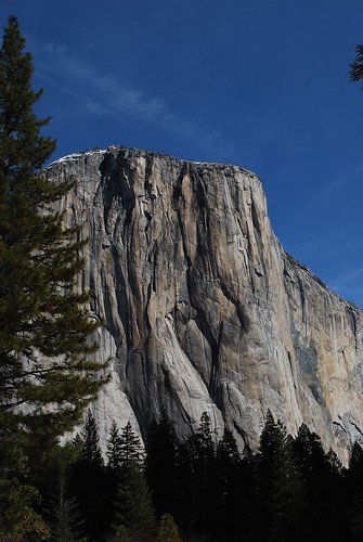
© 2009 Simon Hucko
Here's one that I took in Yosemite, and blew right through when editing. I should have cropped out the little bit of tree on the right of the frame, which I did when I converted it to black and white recently:
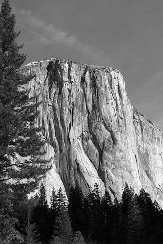
© 2009 Simon Hucko
So remember, you are in control of your image. Take a second and check your entire frame, making sure you are only capturing what you want. You can save yourself a lot of aggravation (and humiliation) down the line.
Full set from last weekend here
~S
© 2009 Simon Hucko
Last night I had the chance to grab my camera and hang out at the Tioga county fair, which is being held right down the street from where we live. The main event of the evening was the demolition derby. While that's not my usual scene, I had fun watching and taking pictures. I was too cheap to pay the $3 to get into the stands, so I found a spot on the fence next to the pit (arena? track? whatever they call it) and watched from there. I think it actually worked out better, since I was near the entrance/exit and got to see all of the cars passing by (either on their own, or aided by the various cleanup equipment):
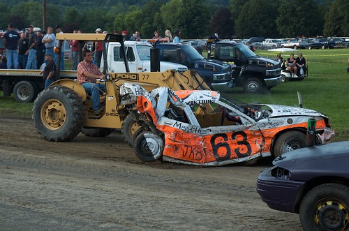
© 2009 Simon Hucko
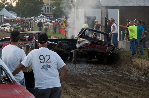
I missed most of the car crunching action, but I don't think it translates very well to still images anyway. It was more fun to watch the people and try to capture the event that way. Like when someone did something they shouldn't have an the officials got rather upset:
© 2009 Simon Hucko
Of course, what would a fair be without food? A lot of food vendors were set up, with some really really good smelling wares. My favorite was the Italian sausage sign (complete with American flag):

© 2009 Simon Hucko
Probably framed that one a little too tight, but I had my 50mm on at that point and it was hard to get back far enough.
My final adventure of the evening was watching Brian, the chainsaw carving guy (from Masters of the Chainsaw) turn a log into a bear. He was inside a netted off area to prevent debris from flying all over. Shooting through a fence/net like that is sort of lame, but I grabbed a few shots anyway. He saw me taking pictures, and when he stopped to switch chainsaws (he had like 7 of them lined up) he asked if I was shooting for the paper. "Nope, just for myself, but I'd be happy to send them to you if you give me an e-mail address." Well, he did, and then he asked if I wanted to come inside the net and shoot. Heck yes I would. I spent probably 10 minutes firing away inside the fence, got covered in bits of wood, and got some great shots:

© 2009 Simon Hucko

© 2009 Simon Hucko
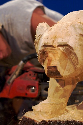
© 2009 Simon Hucko
It was a cool opportunity, and I would say I had more fun than I had anticipated. I wussed out and didn't photograph any of the people at the fair (there were some great moments like a little kid sitting in his mom's lap doing one of those squirtgun races), so maybe I'll go back this weekend and try to overcome my fear of getting in trouble...
Full set from last night here
~S
© 2009 Simon Hucko
I talked the other day about how your camera meters a scene. In there I mentioned that your meter assumes that every scene is 18% gray, which is an average for a "normal" scene. If you just go with the meter, you're going to end up with pictures that look dull and gray. This is a mistake that all new photographers make (including myself), and a quick stroll through Flickr will show you plenty of examples.
To prove my point, I grabbed a quick flower shot. The first picture was taken using matrix metering with no exposure compensation. The second was taken at EV +1. These are straight conversions from Aperture, with only the standard RAW developing (no exposure or levels adjustments):


As good as the camera's meter is, it got confused by all of the white, and thought the scene was brighter than it really was. By setting the exposure compensation to +1, I counteracted this and got a correctly exposed picture. This was an extreme example where I knew the meter would get it wrong, but there are many times when walking around that the meter will expose under where it should be because of a bright patch in the scene. It's not the meter's fault, that's what it was designed to do. You just have to realize what's going on and make the necessary adjustments, either in camera or in post. (But that's lazy. Do it in camera.)
Just for kicks, I did a quick edit on the second photo:

I did a custom white balance on the petals to make them truly white, boosted the saturation, adjusted the levels until I got the brightness and contrast that I wanted, did some noise reduction and edge sharpening, and then added some vignetting. You can see that it ended up even brighter than the "properly exposed" shot above. I considered it properly exposed because it held the highlight detail (texture on the flower petals). I pulled the middle tones up to give it more overall brightness without losing the detail on the flowers. If I had exposed for where I wanted the leaves to be, the flowers would have blown out and lost all detail.
Look through your photos and see if you can find ones that are underexposed. Try to figure out why your meter did what it did. Pull them into your image editing software and see if you can get a better result with a little tweaking. And remember - friends don't let friends post underexposed photos to the internet.
~S
© 2009 Simon Hucko
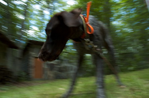
Looking for a way to spice up your action shots? Try adding some motion using a pan-blur technique. The picture above is of our friends' hyper one-year old puppy, Mea. She was at the cabin with us this weekend, and ran around the entire time. I was taking pictures of her, and she was moving around so quickly that I ended up getting a few blurry shots. It was a happy accident, and I thought I'd try to emphasize her playfulness using a pan-blur technique. I set my lens to wide angle, held it low at her eye level, and tried to keep it in constant motion with her head while I released the shutter. There were a lot of unusable shots, but I was rewarded with the shot above, which I think really captures her spirit and my experience with her over the weekend
Below is a more typical example of a pan-blur shot I took at the Tour of California race in February of this year. Sports shooters use this technique a lot to show subject motion and to help isolate the subject from the background. Again, this turned out to be one of the few usable shots I got (shooting bikers flying by at 30mph is hard), but it's one of my favorites from the race.

© 2009 Simon Hucko
To summarize: set your camera to a long-ish shutter speed (1/100 is a good starting place). Follow your subject in the viewfinder (pan). While you're moving, press the shutter keeping the motion of the camera locked with the subject. Repeat. That last step is important - you're going to miss a lot of these, especially when you first start. The more you shoot, the higher your chances of success. Also, as you practice, you'll get better at keeping the camera motion steady while you release the shutter.
Give it a try next time you're shooting something that moves (kids, animals, cars, sports, bikes, marbles, whatever).
~S
© 2009 Simon Hucko
Most cameras today come with the option of using one of three metering modes: a matrix (Nikon) or evaluative (Canon) mode, a center-weighted mode, and a spot metering mode. For this discussion I'm going to refer to matrix metering instead of evaluative since I shoot Nikon, but the principle is the same for all systems.
Spot metering is the simplest. Your camera meters from a very small spot, generally centered in the selected focus point, and sets exposure for that spot to come out at 18% luminance. 18% luminance is also called "middle gray," and is the standard for metering dating back to the advent of the zone system. This mode works well if you are metering off of a gray card, but if you're metering on anything else you're going to have to really understand tonal relationships (ie zone system) to get good, consistent results. Too much work, in my opinion, so I never use spot metering while I'm shooting.
Center-weighted metering is a little more complicated. In this mode, the meter looks at the entire scene, but gives 75% weight to a small circle in the middle when calculating exposure. It's similar to spot metering, in that the camera exposes mainly for the center target, but it's a little more forgiving and makes some attempt to avoid over- or under-exposure of the rest of the scene. I like to use this mode when shooting people indoors with my 50mm. I set up my camera to lock the exposure on the half-press of the shutter. When I go to take a picture, I put the middle AF area on the person's eye and focus/lock exposure, then re-compose the shot and take the picture. This way I get a nice consistent exposure on people's faces, independent of whatever's going on in the background.
Matrix metering is partially responsible for the high cost of your camera. The meter looks at the entire scene, and then a computer analyzes the tonal range, contrast, location of bright and dark spots, etc. It then decides on what type of scene you are metering and sets the proper exposure. Most of the time, it does a darn good job. I use this for my walk around shooting and rarely have to fiddle with exposure compensation. From what I've read, the Nikon metering system is designed to preserve highlight detail if possible, whereas Canon is less conservative and can lead to blown highlights if you're not careful. There are merits to both approaches, but that's a post for another day.
Knowing how your meter works and how it responds to different situations can help you get more consistent results from your camera, and save you a lot of time and frustration in the field and in post. As always, the best way to learn is to practice.
________________________________________________
Thanks to my friend Matt for the suggestion for today's post. If you have any questions or anything you'd like covered, feel free to ask (in comments or by e-mail or on twitter or whatever) and I'll see what I can do.
~S

© 2009 Simon Hucko
With 4th of July coming this weekend here in the states and many other festivals around the world during the summer, I thought I'd share a link about shooting fireworks:
How to photograph fireworks (Digital-photography-school.com)
There are many such tutorials online, just google "photographing fireworks" ("shooting fireworks" gives quite a different list of how-to's). Feel free to share your experiences/results in the comments below! I've never photographed fireworks (obviously, since I have a picture of playing frisbee above instead of an awesome fireworks shot), so I'm looking forward to giving it a try :)
~S
© 2009 Simon Hucko
Today's link is to PixSylated blog's "Lessons I Didn't Learn In Photo School" series. LIDLIPS is a weekly installment on the blog from photographer/blogger Syl Arena. As the name suggests, Syl shares lessons learned from personal experiences in the business, and offers nice insight into the mind of a working photographer. I suggest you check it out, and add his blog to your RSS reader (feed here)
~S
![[title of blog]](https://blogger.googleusercontent.com/img/b/R29vZ2xl/AVvXsEhJ8bvx_9_zOAREbXcrJRML7aVvJMbb90IYYYuyti384jeZHYQ9t8MK6_Kpt_1P4-pZw-QfF9kh4Sqci0vbopzLme862PPhuyPJcc7pRLUW1K1aNzts5YzuXIhgonq66MpjJCqfiWtfwUw/s1600-r/waterfall.png)