skip to main |
skip to sidebar

© 2010 Simon Hucko. All rights reserved. Please DO NOT use this photo without permission
Week 7 and things are going strong. Glad to see all of the submissions this week, looks like the little slump we had is coming to an end. Sorry for the lateness of my comments and this post - things are a little crazy at the Hucko household right now because the musical that my wife is choreographing/costuming opens this coming weekend. As such, I've been going to rehearsals lately to take some photos of the kids and to help out by providing moral support and picking up lunch/dinner when necessary. My photo this week was taken at one of the dress rehearsals, and I chose this one out of the (literally) hundreds of others because of the energy and great expressions. It's definitely worth viewing larger. My one big critique of this photo is that I cut the edge of his foot off. After going through my photos from the first day of shooting, I noticed that I do this pretty often. Fortunately, I've had the opportunity to go back several times and work on this, and I'm getting better. Remember, critiquing your own work is absolutely necessary if you want to get better as a photographer.
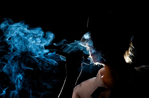
Congratulations to Matt Beaty for this week's winner:
© Matt Beaty
I really like the mystery of this shot. Great use of back lighting to give the silhouette and to highlight the texture of the smoke. It feels a bit cinematic to me, this could definitely be a still from a gritty film noir type movie.
And while I'm at it, Matt also has a great blog about his experiences at photo school. Check it out over at Vault Blog. His writeup about this shoot can be found here
That's it for this week. Keep up the great work everyone!
~S
[title of blog] on flickr
© 2010 Simon Hucko
Those of you who remember the days of manual focus and intricate depth of field scales painted onto the lens can skip this one (and try not to laugh too much on your way out). For the rest of you, I'm going to let you in on a little bit of physics magic that will take your landscape photos to the next level - the hyperfocal distance (wikipedia.org).
Sparing you the physics of it all, by focusing your lens to its hyperfocal distance you get as much of your image in focus as possible. This is especially useful for landscape photography where you want a sharp horizon but there are interesting elements in the foreground. Rather than focusing to infinity and losing some sharpness up close, you can focus closer and push that plane of focus into the foreground. The net result is a shot that is sharp from front to back, giving you the most detail possible. Another great advantage of using the hyperfocal distance is that you don't need to focus on your subjects as long as they're a minimum distance away. Just point and shoot - great for shooting without looking.
The hyperfocal distance is a property of the lens' focal length, selected aperture, and the sensor size. Here's a handy little depth of field calculator that does the math for you: DOFmaster. I've gone through and noted the hyperfocal distance for some useful focal length/aperture combinations so that I don't need wifi while I'm trekking through the mountains to get the desired results. Those of you with iPhones and whatnot can download a program that will do this for you on the go.
OK, so you've got the hyperfocal distance all figured out, but then realize that you have no distance scale on your lens! (Or the one that's there isn't very good.) Modern lenses (especially the less expensive ones) are designed for use with auto-focus systems, so they save money by removing the distance and depth of field scales from the focusing ring. Don't panic, you can fudge the hyperfocal thing by setting your aperture to f/11 or f/16 and focusing on something 1/3 of the way into the scene. There's no guarantee you'll get the maximum depth of field this way, but your results should be pretty good.
If you are lucky enough to have a lens with depth of field scales on it, you don't even need to look up your hyperfocal distance. Just line up the infinity focus point with the far depth of field line for the aperture you're using. Done. Simple as that.
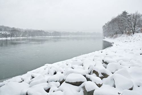
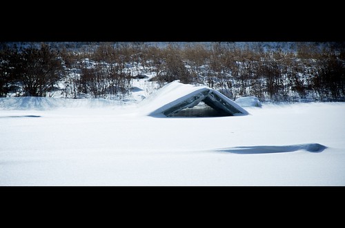
Today's shot was taken at the hyperfocal distance for my lens (about 9ft at 18mm f/8, very convenient as that's the first value on the distance scale for this lens). You can see that the rocks in the foreground are in focus. It's a little snowy, but I assure you that the horizon is in focus as well.
So there you go, another handy technique to add to your photography tool belt.
~S
[title of blog] on flickr
© 2010 Simon Hucko
Another week has passed. Seems like our numbers are dwindling a little - I'm hoping it's just a lack of inspiration and that things will pick up again soon. It's hard to hit a slump in your photography where you just don't feel inspired. This is a good time to try something different (see my post from last week for a few suggestions).
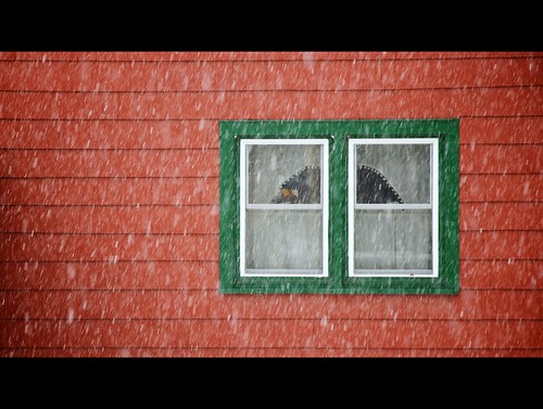
My photo this week was taken off our back porch. I went for a walk around town, but ended up liking this shot the best of anything I got. My point here is that you don't have to go far to find an image, you just have to learn to look at your surroundings with a creative eye. The 16x9 crop is something I've been playing with lately. I've been experimenting with different aspect ratios in the past month or two (square, 16x9, 4x5, etc), and am starting to get a feel for how each one affects an image. I haven't quite gotten to the point of visualizing the format before I take a photo (with rare exception), but I'm working on it.
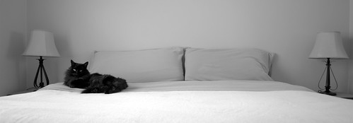
On to why you're here. This week's winner is djhucko for "Black Cat on White Bed"
© 2010 Dan Hucko
I'm digging the symmetry and the great b/w tones. I like the panoramic crop, too, I think it helps put the focus on the symmetry and the lack thereof (ie the cat). Which, by the way, is a great way to pull focus to a subject - have it stand out and contradict the background by breaking a pattern. Nicely done.
That's it for this week. Get out there and get shooting! Don't worry if you've missed a week or two, it's easy to get back on the horse and start submitting again.
~S
[title of blog] on flickr
© 2010 Simon Hucko
Shooting in the snow can be very rewarding, but also very frustrating. I've already talked a bit about how the cold affects your camera (Cold weather? No problem!), but I didn't go into how snow can affect your exposure.
The main issue when shooting in snow is that your meter is going to get confused. (See here for more on how your meter works.) Because of how they're designed, camera meters tend to underexpose snowy scenes. They see all of the white, and try to normalize the scene to 18% gray. This is especially true on overcast days when the dynamic range of the scene is relatively small. If you look at the histogram of a shot taken on a day like this, you'll see a big peak in the middle, and your photo will be gray and muddy. An easy fix is to adjust your exposure compensation up a stop or so. On a sunny day the dynamic range will be larger, but your meter will expose differently depending on how much snow is in the frame (more snow will result in underexposure). This drives me nuts, and I usually switch over to manual exposure at this point. You can also ride your exposure compensation, but expect to do a lot of fiddling.
No matter what method you choose, learn to love your histogram. A quick glance will tell you exactly where your exposure lies, and what you need to do to get the exposure you want. Generally, you want the rightmost peak of the histogram to just touch the right edge. If you're shooting RAW, you may even want to blow out the highlights just a touch, as you'll be able to get them back in post. If you're still not using your histogram when you shoot, you're missing out on one of the best tools that digital photography has to offer, and I highly suggest you turn it on. It might seem like kind of a nerdy intimidating thing, but it's an extremely simple visual representation of your exposure, and a lot more accurate than trying to judge from your uncalibrated high contrast LCD (that will look different depending on what lighting conditions you're in). For a basic explanation of what a histogram is and how to use it, see here (luminous-landscape.com) - check out the "high key" example near the bottom to see what I meant by low dynamic range snow shots.
Finally, when you get to editing your snow photos, don't be afraid to boost brightness/exposure after the fact if you didn't quite get there in camera. You may also want to pull the mid tones and shadows up if you're shooting on a sunny day and exposed to hold some texture in the snow. If your photos are a little flat (overcast day), add some contrast back in to give them some punch. Consider some black and white conversions (snow looks great in black and white).
Hope this was helpful. As always, any comments or questions are welcome :)
~S
[title of blog] on flickr
© 2010 Simon Hucko
Judging from the number of submissions this week, seems like people are having a harder time finding things to shoot every week. It's a difficult time of year for photography, especially if you do most of your shooting outside. Cold, snowy weather can make for some great images, but finding time to get out while there's still light and forcing yourself to freeze for a shot is not the easiest thing in the world. If you're having trouble, I suggest experimenting with some different types of photography. A desk lamp and a few sheets of paper can make a quick table-top studio. Browse Craigslist or take a trip to a thrift shop and see if you can find an old film camera to experiment with. Try borrowing or renting a new lens (check out lensrentals.com or borrowlenses.com). Take an old photo school exercise - lock yourself in a room (classically the bathroom) and take 100 shots. Meet up with other photographers in your area and go for a photo walk. Shoot with your camera phone and document things you see during the day. Ask a friend or family member if you can take their portrait. If you have any other suggestions, please comment here or on the flickr group with them.
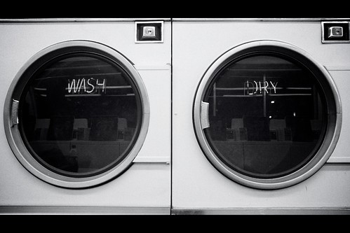
My photo this week is actually a re-make of a photo I took about a year ago. That may seem like cheating, but I wasn't 100% happy with how the first one turned out (even though I really liked the concept). Sometimes it's good to re-visit old photos and see if you can improve on them. There is less distortion with this one, and the framing is a lot better than last time. I also added in some grain and a heavier vignette, and topped it off by boosting the contrast a bit. A 16x9 crop happened to line up perfectly with the lines in the photo, and fits into my recent cinematic mood. I'm much happier with the results this time around.
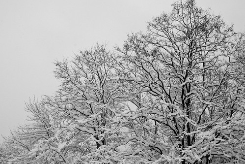
This week's winner is themanilow with "5.52"
© themanilow
Plenty of interesting lines and textures here. I like how the branches cut a diagonal across the frame, too (in fact, I might have highlighted that by cropping to 8x10 and cutting out that little triangle at the top right). Great wintery abstract shot :)
Keep up the good work everyone. You can do it!
~S
[title of blog] on flickr
© 2010 Simon Hucko
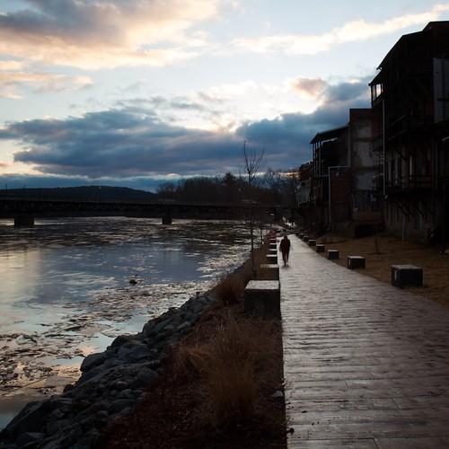
This week's post is about a compositional tool known as leading lines. Leading lines (appropriately enough) are strong lines in your photo that will lead the viewer's eyes along them. These can come from roads, buildings, fences, shorelines, trees, or anything else that gives a clear path for your eye to follow. If you're aware of them and use them correctly, leading lines can add a lot of strength to your composition.
Take today's photo. In this case, all of the lines in the photo lead to the woman walking up the path. I cropped this shot square to help accentuate these lines, and I think it added a lot to the composition. Leading lines can also be used to draw a viewer back into your image. Try it - look at the photo for a bit and let your eyes wander. When you come to one of the lines, your eyes will naturally start following it toward the middle of the photo. If I am photographing a scene with some sort of strong lines in the foreground, I try to use this to my advantage and frame the shot so that they are near the corners leading into the scene. This will draw people farther into your photo and keep them interested longer.
Leading lines are not always a good thing, though. If you have lines that lead away from your subject, you can draw people away from the main intent of your photo. Worse, sometimes lines will lead a viewer right out of the frame and they'll never return. As with all "rules" of composition you can choose to break these to get a certain effect - in this case, to add a feeling of tension to your shot.
Next time you're out photographing, look around you for the lines in your scene and try to incorporate them into your image. It won't always work, but when it does the results can be great.
~S
[title of blog] on flickr
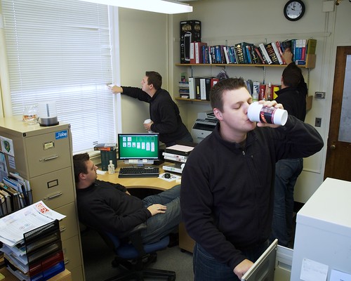
© 2010 Simon Hucko
I don't know about the rest of you, but this was a tough week for me photographically. Between my schedule at work and the awful weather, I didn't have a chance to get out and shoot during the week. I was feeling pretty uninspired, until I had a conversation with Stacey about clone photos (photos with multiples of the same person). I made one a while ago, and decided to give it another shot. I had to go into work for a bit on Saturday morning, so while I was waiting for my samples to finish drying I took a series of photos that were later merged into the image above. If you've never done something like this, it's actually relatively simple. Set up a tripod, shoot on manual everything so that the images are all the same, add all the photos as different layers in Photoshop or GIMP, and use layer masks to paint in the different people on each layer (a quick search for layer masking should give you the necessary info for how to go about this). It's a bit of a digital photography cliché, I know, but it's fun to play around with.
Enough about me. This week's winner is slithy-toves for her photo, "Mmmm Sundays"
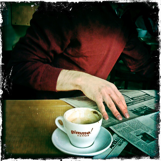
© Stacey Shackford
One of my favorite things about this photo is that it was taken with an iPhone. That doesn't make the image any better or worse, but that's the point. It's easy to get caught up in camera gear and techniques, but in the end the image is what really matters. I like the classic feel of the square crop here, the great relaxed atmosphere, and the processing to give it a nice distressed, comfortable feeling (like a good pair of jeans). The title is very appropriate, and I definitely get the feeling of a laid back Sunday morning at the coffee house. Nicely done.
That's it for this week. Keep up the great work everyone! And check back here and at the group this week for an announcement about monthly themes.
~S
[title of blog] on flickr
![[title of blog]](https://blogger.googleusercontent.com/img/b/R29vZ2xl/AVvXsEhJ8bvx_9_zOAREbXcrJRML7aVvJMbb90IYYYuyti384jeZHYQ9t8MK6_Kpt_1P4-pZw-QfF9kh4Sqci0vbopzLme862PPhuyPJcc7pRLUW1K1aNzts5YzuXIhgonq66MpjJCqfiWtfwUw/s1600-r/waterfall.png)


 Posts
Posts

