skip to main |
skip to sidebar
© 2009 Simon Hucko
Today's advice - edit your photographs before sharing them! I mean this in two ways. First, always always always run your photos through some sort of image editor. Even for snapshots at a family event, spending about 30 seconds per shot to edit brightness/exposure, contrast, straighten the photos if needed, and crop if needed (more on that some other time) can dramatically improve your photos. If you're shooting RAW, you're going to want to add some mild sharpening and noise reduction to that list, since it's not being done in camera.
Second, even before you go and adjust your photos you should decide on what shots you want to share with the world. If you take 10 different shots of the same subject (a flower, for instance), don't edit and upload all 10. Pick the best one, and stick to that. People judge you as a photographer based on the output that they see. You can instantly become a better photographer by only sharing your best work.
Let me repeat that - you can instantly become a better photographer by only sharing your best work. And as you improve at your craft, your standards for what make the cut should increase as well. Most image editors have some sort of image rating system built in, so you can quickly flip through what you've captured and mark what gets edited and shared, and what gets archived and never viewed again (or even deleted, but you didn't hear that from me).
This isn't meant to discourage you from sharing your work. But a little judicious self-editing can go a long way.
~S

© 2009 Simon Hucko
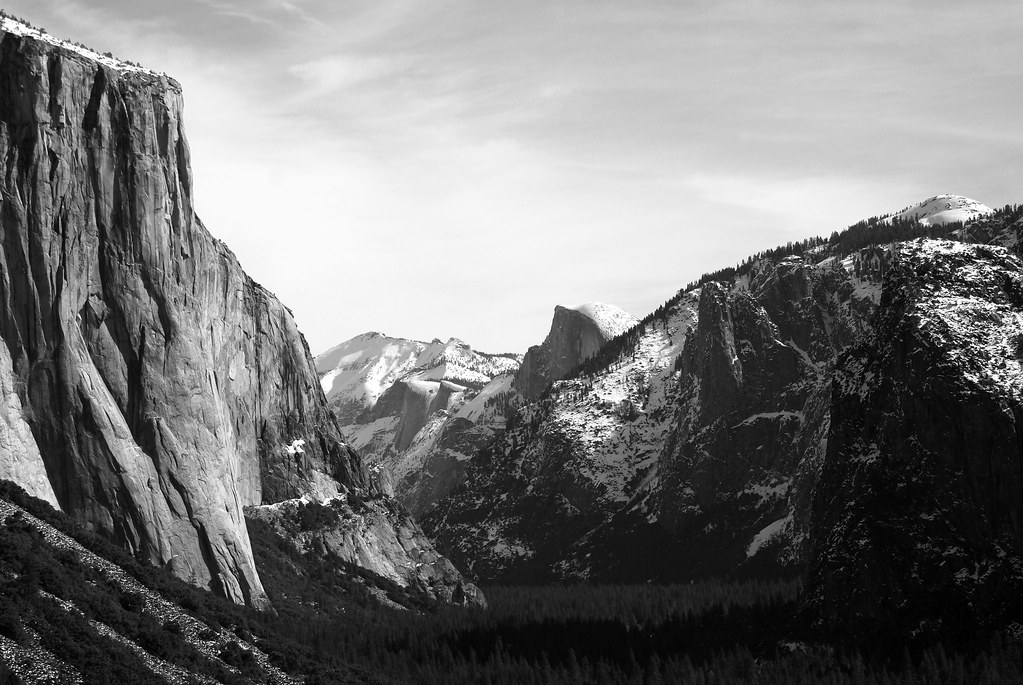
Today's post is about converting your color shots to black and white. You can just click the button to make the conversion, but to get the best black and white shots you're going to want to do some additional work.
Take the two images below:

© 2009 Simon Hucko

© 2009 Simon Hucko
The conversion to black and white really makes the texture of the trees stand out.
I did the conversion in Picasa, but the principles are the same no matter what editor you choose. The first step is deciding how you want the color channels (RGB) to be represented in black and white. You could just completely de-saturate the image, which will leave you with the luminance portion of each pixel. However, this will usually not give the best results. Using a channel mixer to decide how much of each channel gets used can help enhance the contrast of your image and generally produces a better result. Picasa doesn't have a channel mixer, but it does give you the option to do a "filtered black and white" conversion. The reference is to when photographers used to put different color filters over their lens before shooting on b/w film to enhance contrast or produce a specific look, but essentially it behaves like a channel mixer. See here for a good explanation on how this works.
After doing a filtered conversion, you're also going to want to tweak the levels in your photo. Colors appear more saturated at lower luminance levels, and while texture is important, color is usually the dominating source of contrast and interest in a picture. When converting to black and white, all you have is texture and tones to make an interesting image. Contrast and detail become very important. I boosted the highlights and the mid-tones of the above shot in order to bring up the texture on the bark. Generally, a boost in the highlights and mid-tones will be required. Things that look almost white in color can take on a gray cast when converted, and that will have to be corrected for.
I haven't really done much black and white up until now, but after playing with the Yosemite pictures and doing several conversions (see album here) I may have to do more.
~S

Today's link is to Photographer's Math, a "blog" that runs more like a comic strip. Each entry is like the one above - expressing some aspect of the photography industry as an equation. They tend to be very tongue in cheek, and are worth a few chuckles. Unfortunately, they've been on hiatus since last Friday, with a promise that they'll "be back soon." So read through the archives, and add them to your RSS [feed]
__________________________
Super excited to set up our new iMac this weekend, and hopefully have a chance to flush out the Depth of Field article I've been working on. TGIF and have a good weekend, everyone.
~S
© 2009 Simon Hucko
If you're like me, photography is a hobby. As much as I'd like to rake in the big bucks selling my work, I don't make a living from photography and I can't justify spending money on studio gear. However, a little lighting can go a long way to improve your photography, and it's a lot of fun to do. DIYPhotography.net is an excellent resource for low budget DIY photo gear. Most of the materials can be sourced from Home Depot (or similar hardware store) and are much cheaper than paying outright for photography equipment. They are currently running a series about everything you need to set up your own DIY studio at home, which is a collection of tips, tricks, and gear that they've run over the past few years aimed at getting your cheap home studio up and running. Another good one for your RSS reader [feed]
~S

Going off topic today. I just spent most of my day in a Red Cross CPR/AED class offered here at work, renewing my certification. Between Boy Scouts and lifeguarding, I have been trained in first aid and CPR for 10+ years. Fortunately (knock on wood), I've never had to use my knowledge beyond minor cuts and bumps. However, I feel good knowing that I could help out if something ever did happen.
If you've never taken a class, I strongly recommend that you take basic First Aid and Adult CPR/AED. Most community centers offer classes, and some offices (like mine) have started offering these classes to employees. If you work at a larger office, especially if you have an AED in your building, ask your employer about training. If you took CPR more than 1 or 2 years ago, the curriculum has changed and it's definitely worth a refresher.
Just having the confidence to take charge of a situation, call 911 and provide some basic level of care (especially CPR/AED) can mean the difference between life and death. You owe it to yourself, your coworkers, your children, your significant other, your friends, and even the complete strangers you pass on the street. After all, wouldn't you want someone to be able to help you if you ever needed it?
~S
You may have noticed the new header for my blog. Would you believe I created it with Microsoft Paint?
Yep, that's right. The crappy little sketchbook that every Windows user loves to doodle in - Paint. But, with minimal effort I managed to create a pretty classy looking header. I actually did the same thing for the first header, below:

© 2009 Simon Hucko
Here's the original image:

© 2009 Simon Hucko
After cropping down to the shoe, there still wasn't enough space to the right to get a true header feel. No problem, went to Image -> Attributes and changed the width of the image. I then used the eye dropper to pick part of the sky and filled the new space with that blue. I also used the paintbrush with the same color to touch up the noise in the image and get rid of some of the .jpg artifacts around the boot and wires. I then dropped in a text box using the same font as the blog (Trebuchet MS) and picked a darker blue for the text.
NOTE: make sure you save things like this as .png, not .jpg. Otherwise, you end up with compression artifacts, especially around the text. Very annoying
I did pretty much the same process for the current header. Here's the original picture:

© 2009 Simon Hucko
I picked a "white" spot off of the background using the eyedropper. I then evened out the background using the paintbrush to get rid of the falloff and color casts. Image -> Attributes to add width to the image, and a quick fill to even out the background. I used the eyedropper again to select the blue from the highlighter, and created the text. Save as .png. Less than 5 minutes of work, and I can do it from just about anywhere.
True, Photoshop would probably have been easier and certainly more powerful for this sort of thing. But I don't have Photoshop, and Paint worked well enough in a pinch. I'm sure there's an equivalent application for the Mac users, too (and I'll find out this weekend when we finally unbox and setup our new iMac!)
So don't be afraid/ashamed to use the basic tools available to you. It's like the saying goes for cameras: "The best camera is the one you have with you." My version - "The best pixel editor is the free one that came with your computer." Or something like that
~S

© 2009 Aaron Johnson
Today's link is to webcomic What The Duck?. Created by photographer Aaron Johnson, WTD chronicles moments in the life of a professional photographer. I find it very entertaining, and I'm sure it rings especially true if you are (or ever have been) a working pro. This is definitely a fun one to have in your RSS reader [feed].
________________________________
© 2009 Simon Hucko
Today's image (above) inspired me to write a rather lengthy article about depth of field. I want to get some example photographs ready to go with it, so it may take me a few days to get everything sorted out. Stay tuned
~S
![[title of blog]](https://blogger.googleusercontent.com/img/b/R29vZ2xl/AVvXsEhJ8bvx_9_zOAREbXcrJRML7aVvJMbb90IYYYuyti384jeZHYQ9t8MK6_Kpt_1P4-pZw-QfF9kh4Sqci0vbopzLme862PPhuyPJcc7pRLUW1K1aNzts5YzuXIhgonq66MpjJCqfiWtfwUw/s1600-r/waterfall.png)