skip to main |
skip to sidebar
© 2010 Simon Hucko
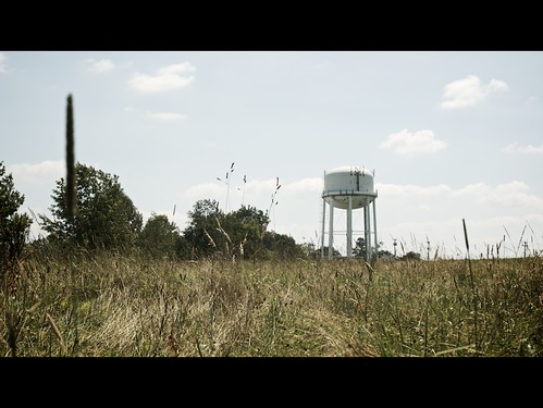
I finally got out for a walk or two this week with my camera, and grabbed some photos I'm happy with. I've been in a bit of a rut lately for whatever reason, so it was nice to finally get some decent shots.
I also decided to try something new when processing these photos. I've been having fun mutilating photos taken with my phone camera, and thought I'd start being more aggressive with editing photos on my computer. I wanted to go for a "summery" look, given the heat lately and the bit of haze on the days I was shooting.
The first step was to warm the photos up a bit by changing the white balance, 'cause hey, summer is warm, right? I did this in post (one of the best parts of shooting RAW), but you could even do it in camera by selecting the "cloudy" or "shade" white balance option. I then knocked the saturation down to about 70%. This gives it a slightly washed-out look, which you experience in real life on those humid hazy days. You may have to go a bit farther, my starting point is already a little muted due to the RAW processing. I bumped the contrast a bit and added sharpening as part of my normal RAW workflow. The end result has a sort of washed-out film look to it that just says "summer" to me.
In the spirit of continuing to expand my processing prowess, I plan on trying out a few more looks and posting how I did it. I'm also going to try to explain why I did it. I think the motivation behind processing is important. If you're just applying some photoshop plugin because you think it looks cool and can't relate it back to the image, it doesn't really advance your art.
So what do you think? Did I get the "summer" look right? Any other looks you've seen and want me to take on? Comment!
~S
[title of blog] on flickr

© 2009 Simon Hucko
With the progression of photo editing software, it has never been easier to add some creative processing to your images. Black and white, sepia toning, cross-processing, de-saturation, over-saturation, selective color, vignetting, color balance shifts - the list goes on and on. When used correctly, these techniques can bring a whole new feeling to an image.
The image above was taken in Times Square on Sunday. The color shot had some neon on the left that distracted from the main subject. By converting to black and white, I eliminated that distraction and put the focus back onto the man with the bicycle. It also makes the image feel older, creating the feeling (to me at least) that it's the city that's out of place, not the man with the bike. That bit of creative processing turned a good shot into a great one.
© 2009 Simon Hucko
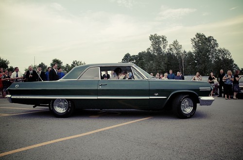
This shot benefited from some cross-processing. Cross-processing is a technique that used to be applied to film and gave it that washed out warm look that many of us associate with old color photographs (more to come on this, I promise). I wanted to create that feeling with this image to compliment the awesome vintage car they were leaving in. Here's the same image without the cross-processing applied:

Nice, but to me it doesn't have the same visual and emotional impact as the processed image.
It's easy to get caught up in digital processing and apply crazy creative effects to every photo you take. The key to making an impact with your processing is to have some motivation behind it. Why are you choosing to process your image that way? What effect does it have, both visually and emotionally? How does it help tell the story you want? Just like focal length, framing, composition, lighting and timing, processing is another important step in the creative process. Don't throw away the work you put into making a good photograph by applying unnecessary effects in post.
________________________________
[[Warning - shameless self promotion]]
I really like today's first image (view it larger here), and am considering making a print edition available. Is there any interest for that? Haven't figured out the specifics yet, but it would be a larger format limited edition signed print, possibly matted. Thoughts?
~S
[title of blog] on flickr
![[title of blog]](https://blogger.googleusercontent.com/img/b/R29vZ2xl/AVvXsEhJ8bvx_9_zOAREbXcrJRML7aVvJMbb90IYYYuyti384jeZHYQ9t8MK6_Kpt_1P4-pZw-QfF9kh4Sqci0vbopzLme862PPhuyPJcc7pRLUW1K1aNzts5YzuXIhgonq66MpjJCqfiWtfwUw/s1600-r/waterfall.png)