© 2010 Simon Hucko
I've mentioned aspect ratio in passing several times here, but I thought I'd dedicate a post to it, especially since it's something I've been working on lately.
The aspect ratio of an image is the proportion of the photo's dimensions (ie how wide it is compared with how tall). Common aspect ratios for photography are 3:2 (4x6 prints), 4:3, 5:4 (8x10 prints), 1:1 (square), and increasingly 16:9 (widescreen HD). Technically you can crop a digital image to any aspect ratio that you want, but it's much easier to print or display your photos if you stick to the normal formats.
So why so many formats? Why don't we all shoot the same thing? It would make printing and photo site design much easier, as you wouldn't have to worry about differently sized photos popping up. There are two answers to this question, a technical one and a creative one.
The technical answer has to do with legacy film formats. 35mm film has a 3:2 aspect ratio, which is why most DSLR cameras are 3:2 as well. Common medium format aspect ratios were 6x4.5 (4:3), 6x6, 6x7 and 6x9. Large format (sheet film) comes in 4x5, 5x7, 8x10, and 11x14. I'm assuming this is where those standard print sizes stem from, as 35mm never really translates well to any of them... 4:3 and 16:9 are also display formats (normal and wide screen TV), so they make sense for digital photo viewing as well. (I'm guessing this is why just about every point n shoot camera is 4:3.)
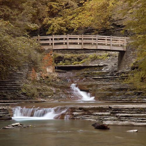
The creative reason (which may have driven the technical development mentioned above) is that every format has a slightly different feel to it. Square format photos have a very static well defined feel to them. As you deviate from square, photos start to feel wider or taller, imparting somewhat of a dynamic feel even before considering the subject. As an example, I took to photos of essentially the same subject last weekend. The first is a square shot -

© 2010 Simon Hucko
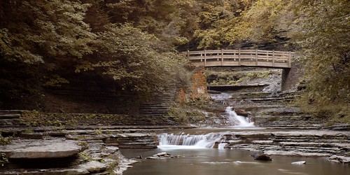
Despite the movement in the water it's a pretty static and calm shot. Compare that with the same scene framed in 2:1 -

© 2010 Simon Hucko - click to see it large
Note that the vertical captured is about the same for the two (from just above the bridge to the bottom of the second little waterfall). This time, however, we're capturing a larger part of the scene. The bridge goes from being a static and self contained subject to part of a sweeping image. (Note also that I bucked those formats I talked about and went with 2:1. If I were to print this at some point I'd have to get it printed in a less wide format like 3:2 and trim it down, then custom mat and frame it. A bit of work, but worth it for wider stuff like this.)
So how do you decide what format to use? Well, that's up to you. As I already mentioned, more square formats tend to feel more static and complete, where wider (or taller) formats can give the feeling of movement. Sometimes the subject dictates what format to use, where the interesting compositional elements are contained in a certain layout and you crop out the rest. Sometimes you have more freedom to choose a format, in which case it's worth experimenting with a few options and seeing what you like.
Often times when I approach a subject I'll have some idea of what I want the final format to be. Certain scenes just look square to me, and certain ones benefit from a bit of extra width. I then compose my shot with the crop in mind, making sure I fit all the elements into the space that I'll wind up using.
If you approach a scene and aren't sure what format you want, my advice is to compose a little loosely so that you'll have more options while editing. Make sure all of the key elements of a scene are in your photo, and then back up or zoom out a little to leave yourself a cushion for cropping. There's nothing worse than going for a square crop and coming up just short of including the entire subject (trust me, I've been there, and 4x5 just isn't the same...)
The right crop can elevate a good photo to greatness. So much of photography is eliminating objects from the frame and only including the ones that add to your story. I strongly suggest familiarizing yourself with the effects of different aspect ratios on your photography. If you have a photo with a good subject that still feels a little unfocused to you, try cropping out different parts of the image and see if you can increase its impact.
I've been getting more and more into square format lately, as a stroll through my photostream will quickly show. I still shoot a lot in 3:2 (the native ratio for my camera) since that's what I compose in. I also like the super wide 16:9 (or 2:1) for certain scenes. I've been on the lookout for vertical 1:2 images as well, but those are hard to come by (if you want a challenge, spend a day shooting for that crop).
What's your favorite aspect ratio?
~S
[title of blog] on flickr
![[title of blog]](https://blogger.googleusercontent.com/img/b/R29vZ2xl/AVvXsEhJ8bvx_9_zOAREbXcrJRML7aVvJMbb90IYYYuyti384jeZHYQ9t8MK6_Kpt_1P4-pZw-QfF9kh4Sqci0vbopzLme862PPhuyPJcc7pRLUW1K1aNzts5YzuXIhgonq66MpjJCqfiWtfwUw/s1600-r/waterfall.png)


I've always enjoyed non-traditional crops. Rather than picking a ratio and cropping with constraints I generally tend to crop an image until it looks right.
ReplyDeleteAs you said, they're a PITA to frame, but on the internetz, you can crop however you want!
I've been thinking about doing circular or other non-traditional cropping ideas, just to see how they come out...
@ Matt - Yeah, I generally don't print my work anyway, so it's not much of a concern. If I do print something, I'll typically go back and crop it for the print size I want (not perfect, but I'm too lazy to mess around with custom work). I generally find that the "normal" aspect ratios work pretty well for most things, so I tend to stick to them anyway (again, easier).
ReplyDeleteCircular would be interesting, I'll keep an eye out for the results ;)