![[title of blog]](https://blogger.googleusercontent.com/img/b/R29vZ2xl/AVvXsEhJ8bvx_9_zOAREbXcrJRML7aVvJMbb90IYYYuyti384jeZHYQ9t8MK6_Kpt_1P4-pZw-QfF9kh4Sqci0vbopzLme862PPhuyPJcc7pRLUW1K1aNzts5YzuXIhgonq66MpjJCqfiWtfwUw/s1600-r/waterfall.png)
© 2009 Simon Hucko
Basic "rules" of composition stipulate that you should not place your subject at the center of the frame. The oft-touted rule of thirds (wikipedia.org) is commonly used by photographers to frame/crop their images, and a lot of cameras even include an optional rule of thirds guide in the viewfinder/preview window. Generally the idea is to keep the main subject out of the center of the frame, which results in a more natural, dynamic image.
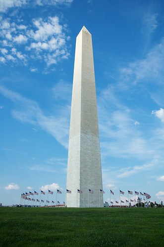
However, there are times when a centered composition can be used very effectively. This is especially true when the subject displays a lot of symmetry, showcased by today's photo of the Washington Monument. The monument, the ring of flags, and the expanse of grass in front all create a very centered and symmetrical feeling. The wisps of clouds in the sky help add a little interest and drama, but the photo would have been fine without them.
© 2009 Simon Hucko
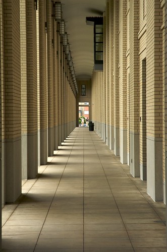
Another example showing a lot of symmetry and a centered "subject." Note that this technique works very well with architecture, since most buildings are designed to be symmetrical, but you can use it with other subjects as well.
Thoughts? Feelings? Comments? Questions? Critiques? Stories? Other symmetry pictures? Please share!
~S
[title of blog] on flickr


I'm a BIG fan of symmetry and have delibertly shot entire portfolios of symmetrical images. It's fun to walk around and discover how much symmetry there is in the world
ReplyDelete