skip to main |
skip to sidebar

© 2010 Simon Hucko
I had every intention of posting a nicely balanced photo of our lit pumpkins on the porch this week, but I missed the deadline. We didn't carve our pumpkins until Sunday, and by the time the light was right the trick-or-treaters were out in force. I still plan on grabbing the shot sometime this week - better late than never, right?
Instead, I give you this dreary and bleak outlook on the death of fall. I feel like I dropped the ball a bit on autumn photos this year, and so when I saw this scene last week I just had to stop and capture it. I think it pretty well sums up my feelings about the weather right now - moody and depressing. Trying to get over it and find things to photograph to carry me through the end of the year.
This week's pick is "Flasher" by slithy-toves:

Very apropos for the Halloween theme, especially with the little flecks of orange in the photo (some weird sort of flare?). The lensbaby adds a nice creepy blur to it, which is very fitting of the subject. Spooky stuff :)
In honor of daylight savings time ending this weekend here in the states, this week's theme will be "time." Show me what you got.
~S
[title of blog] on flickr

© 2010 Simon Hucko
One of the biggest pitfalls for new photographers is choosing a tripod. Most photographers don't even buy a tripod to start out with, but eventually we all get to a point where the idea of a tripod is appealing - self portraits, the family Christmas photo, panoramas, long exposures, HDR bracketing, macro photography, etc. You hop online and look for some tripod recommendations, but everything you come across seems pretty expensive ($200+ for a tripod?), so you head over to the local Best Buy or Ritz and fork over 40 bucks for a cheap aluminum and plastic model. It has 3 legs, a camera mount, and is nice and light and compact. What more could you need? You chuckle with self-satisfaction at the people who are shelling out big money for expensive tripods. Suckers.
Then you start using your tripod. The second or third time you set up the legs and tighten them down on the center column the plastic screw snaps. Oh well, you always set them up wide open anyway, no need for a screw. You start keeping the tripod in your car so you can grab it when you need it. A few weeks later you re-adjust your seat and hear a crunch as you chip the plastic clamps on one of the legs (you forgot the tripod was on the floor behind your seat). No biggie, just a little scarring, and you can bend the leg back into shape so that it'll slide right. A month or so after that you're out on some rocks photographing a sunset. The tripod isn't perfectly level, and a gust of wind comes along and almost topples your camera over (good thing you were there to catch it). OK, you'll just stay within arm's reach of the tripod at all times. Finally, a year later, you pull your tripod out of the car again and notice that one of the feet has broken clean off. Game over.
This is pretty much what I went through with my first tripod (pictured above). I was never really happy with it, and regretted the purchase almost immediately after I started using it. The general rule for tripods is:
Lightweight, Sturdy, Inexpensive - pick two.
Fortunately, before my POS big box special finally broke, I picked up a used tripod on Craigslist. It's an old Bogen monster with a heavy duty 3-way head on it (I don't remember the model numbers). I got it for $60 (super inexpensive) and it's rock solid, but also weighs about 15 pounds (see the rule above) and is only 2 sections so it's about 3 feet long when collapsed. Despite the amount of hiking I do, I can live with that for now - it's easy enough to throw it over a shoulder. Some day I'll get a fancy carbon fiber tripod with a nice light ball head (light and sturdy, and definitely not inexpensive), but that'll have to wait.
If you're just starting out and haven't bought a tripod yet, I suggest saving yourself the agony of the cheap tripod. Even if you don't see yourself using a tripod that often, spending $100 once on a tripod that will last for a lifetime of light use and that you don't have to worry about breaking or knocking over is a much better idea than spending $40 several times on cheap tripods that could lead to other gear damage. Notice I said "light use" - if you want something serious and sturdy, spend the same $100 on a rock solid used tripod. It may be heavy, but you can beat it up and place it down just about anywhere (on rocks, in creeks, in a tornado, whatever) without worry. If you have the money, spending a few hundred on light weight sticks and a few hundred more on a silky smooth ball head will make your life a lot easier and more enjoyable. Hey, no one ever said this stuff was cheap. Think about it as buying another lens.
Have you fallen victim to the cheap tripod? I read a story the other day about a photographer whose camera fell down a cliff because of an unsteady tripod (don't believe the "protective filter" BS, that UV filter did nothing for the lens). Share your horror stories in the comments!
~S
[title of blog] on flickr

© 2010 Simon Hucko
This week was a pretty blah week for me photographically. The weather was blah, the leaves are mostly gone in the places I usually shoot, I was busy with life and didn't have much time for photography, etc. So, the best I could do this week was a cell phone shot of some dead corn against a slate gray sky. Enjoy ;) I'm going to make every effort to take some photos that I'm proud of this week. Hopefully that'll pan out.
My pick this week is "Splash" by irv_b:

For best effect, click here to see it larger. Really digging how the droplets were frozen by a fast shutter speed. The exposure is spot on, too - plenty of detail in the white feathers of the bird. And, for the icing on the cake, the bird is looking directly at the lens. Excellent capture, Irv.
The theme this week is "Halloween." Plenty of options here. 10 weeks left, folks, hop back in and finish strong!
~S
[title of blog] on flickr

© 2010 Simon Hucko
You may have noticed the little signature that has started showing up on all of my photos. Notice I call it a signature and not a watermark. What's the difference? Glad you asked.
Traditionally, a watermark is a security measure designed to authenticate a particular document. In the case of photography, a watermark is generally used by a photographer to prevent image theft. This can be a real concern - if you make your money selling images, what's to prevent anyone from scraping an image off your website and using it for their own means without paying you for it? The honest answer is: nothing. Even embedding images into a flash slideshow doesn't prevent someone from doing a screen capture and having a perfectly good web-res image to use. So by watermarking an image, at least you'll get credit for it when it gets scraped and you can use that as ammo to get paid (or at least get the image taken down), right?
Not necessarily. Turns out anyone with a copy of photoshop can pretty effectively scrub your little watermark right out of the image (even more so with the new content-aware fill in CS5, which is truly an amazing thing to behold). Some photographers counter this by placing a rather large watermark right in an important part of the image, making it extremely difficult to crop or clone out. (Remember, nothing is impossible...) The net result to the viewer is something like this:
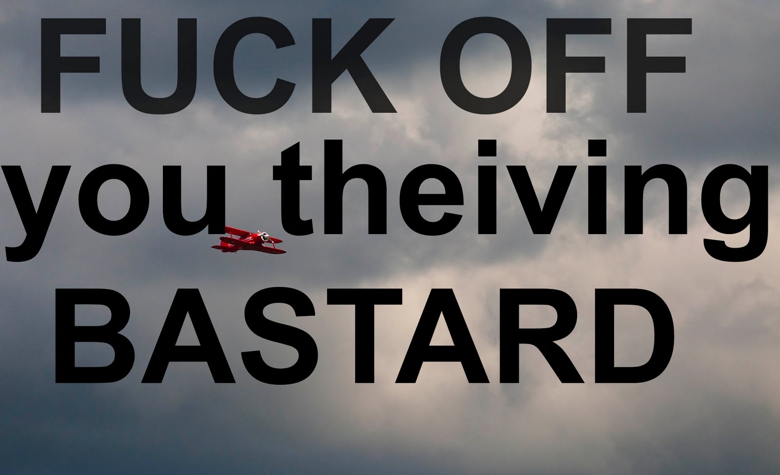
image courtesy of Matt Beaty
This sort of big watermark, even if it's mostly transparent, is an immediate deal-breaker to me. Why would you share your image if you're going to throw something huge and distracting right in the middle of it? Makes no sense.
"OK Simon, so if your little signature isn't protecting your photos, why is it there?" Branding. Most of my photos are up on flickr with a Creative Commons license, which basically says that people are welcome to use my images for non-commercial purposes as long as I get credit for them. My images do make it onto people's blogs from time to time, so having my signature on the image helps to identify it as mine. (It would probably be better if you could actually read my signature, but that's not how I roll.) Because it's not distracting from the image, people are much more likely to leave it there rather than trying to crop or clone it away. It also means that people who are familiar with my work will recognize the signature when they see it, helping to build the brand that is Simon Hucko. It's not a very big deal at the moment, but it's laying the groundwork for future growth (ie if I have images in a gallery, send a bill, sign a book, print a calendar, hand out business cards, etc).
What are your thoughts on the situation? Should photographers watermark their images? Is my signature still too distracting and/or pointless? Should I be doing more to prevent image theft? Comment and let me know.
~S
[title of blog] on flickr

© 2010 Simon Hucko
Well, we managed a few more photos this week, so I guess I'll continue. I know there are some lurkers out there who haven't been posting lately, and I encourage you guys to jump back on. 11 weeks left - you can do it! Plus, with fall here and the holidays coming, there are plenty of photo opportunities, so it shouldn't be hard to shoot something every week. Even a quick photo with a cell phone is better than no photo as long as it speaks to you in some way.
My photo this week is of a scene that I pass every day on the way to work. I love this field with the horses in it, and so often it screams out to me "take a photo!" I don't usually stop (mostly because I don't have a long enough lens to do it justice), but the other day the horses were closer to the road and right up against the changing trees. The power lines are a bit of a bummer (and another reason that I don't photograph this field much), but I can live with it.
My pick this week is "norwich cathedral" by irv_b:

There are so many great things going on with this photo, starting with the great use of framing. From the description: "...I added a bit of flash to lift the details from inside the arches." Great idea, I like the extra bit of detail that you get in the foreground this way. I also like the lighting on the building - sunlight on the subject with moody clouds in the background is one of my favorite things. Great photo of a lovely spot.
This week's theme is "Fall." For the seasonally challenged, you can always tackle a different meaning of the word ;) And, as always, the theme is just a suggestion to get your creative juices flowing. Feel free to post any photo that you want. I hope we'll get a few more of you to come back into the fold this week.
~S
[title of blog] on flickr
I had the opportunity to make a few photo-related purchases for my birthday recently. Something that I've had my eye on for a while is a Lensbaby. Rather than drop $200+ on one of the new ones that I may end up not liking and never using, I opted for a used copy of the last generation of Lensbaby (Lensbaby 2.0). It's basically a Lensbaby Muse with a double glass optic built in, which I figured was a good (and inexpensive) way to get started with the whole Lensbaby thing.
First off, I will say there is a bit of a learning curve. From a technical standpoint, all Lensbabies are manual exposure only, so if you're not comfortable with that you may want to steer clear (the point is to be inspired, not frustrated). Focusing accurately can also be a little tough, and I wound up shooting multiples of most subjects until I got what I was after (image review is helpful for this). From a creative standpoint, there are certain shots and effects that work better than others with this lens, so it takes a bit to get a handle on how to best use it. Of course, there's no *wrong* way to use it (that's kinda the point), but certain looks were more appealing to me than others.
Rather than give a technical review, I'm going to go through a series of shots I took showing the different looks I was able to get from the lens, and you can draw your own conclusions from that. I think that's more meaningful, anyway.
The classic Lensbaby look:

Focus in one part of the frame, everything else is blurring away from it. Because the blur is directional it takes on more of a zoom quality than an out of focus quality. This can be very effective in putting the emphasis on your subject. It also gets pretty old, pretty quickly (in my opinion, anyway), so I started looking for other ways to use the lens.
Tilt-Shift:

A Lensbaby is a pseudo-tilt/shift lens, but the field curvature of the optics messes with that and gives you a round sweet spot instead of a plane of focus. However, judicious framing and cropping can give you that tilt-shift look at the expense of some pixels. This is something I have to explore more.
Shallow Depth of Field:

Just glancing at this photo, it looks like a standard shallow depth of field image. Closer inspection of what is and isn't in focus reveals that there is indeed some Lensbaberie going on, but it's a different feel from the standard Lensbaby look. This is entirely composition and subject dependent - you need to find the right situation to make this work.
Lomo:

This is the look I see myself using most often - a reasonably sharp center blurring away at the edges. The square crop and vignette complete the illusion, and bingo bango - digital Holga. Seems to work best with mostly flat subjects at far distances.
Portrait:
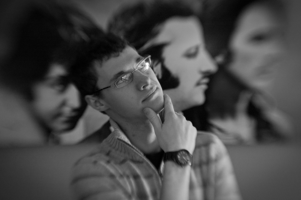
This lens has some good potential as a portrait lens. It certainly puts the focus on your subject's face, and leads to a nice blur in the rest of the photo. I don't do a lot of portrait shots, but I'll have to play with this more. Maybe I'll do a family portrait series over the holidays with it. (Maybe.)
Overall I'm pretty happy with my purchase. Like any specialty lens, it's not something I'll use every day, but it's small and light enough to have earned a permanent spot in my bag. I think it will be a great cure for the blahs that settle in from time to time, and just might save my sanity this winter when the world gets gray and ugly. It also will be fun to pull out for some "different" shots at things like weddings, or on vacation at those touresty areas. And if nothing else, it's a good talking piece with other photographers.
~S
[title of blog] on flickr

Since I'm reading through it for the second time, I figured I would write a little review about "Examples: The making of 40 photographs" by Ansel Adams. (Amazon). Ansel Adams is probably the most well-known American photographer, and is most famous for his stunning black and white images of Yosemite (and black and white landscapes in general). If you aren't aware of his work, I highly recommend checking him out (wikipedia, Ansel Adams gallery).
The reason that I love "Examples" so much is that it's almost like having a conversation with Adams while flipping through his portfolio. Each photo is printed and then followed by 2-3 pages of discussion by Adams about the image. He includes as much as the technical information as he can remember (camera, lens, filter, film, exposure, etc), but also goes beyond the "how" into the "why" - why he was motivated to take this image, what the circumstances surrounding it were, how his feelings about the image have changed over time. He also randomly includes his thoughts about the art and craft of photography (at one point he even mentions how he is excited for the development of digital image capture). While the technical information is interesting to me, it's these little nuggets that really make the book a must-read.
Best of all, it's not that expensive to buy (currently $26.39 on Amazon). It would cost you more to buy postcards of the 40 photos in the book. If nothing else, this would be a good one to add to your holiday wishlist.
~S
[title of blog] on flickr
![[title of blog]](https://blogger.googleusercontent.com/img/b/R29vZ2xl/AVvXsEhJ8bvx_9_zOAREbXcrJRML7aVvJMbb90IYYYuyti384jeZHYQ9t8MK6_Kpt_1P4-pZw-QfF9kh4Sqci0vbopzLme862PPhuyPJcc7pRLUW1K1aNzts5YzuXIhgonq66MpjJCqfiWtfwUw/s1600-r/waterfall.png)


 Posts
Posts

